Ionic简介
一、简介
1、简介
Ionic Framework是一个开源的UI工具包,可以使用集成了框架(如Angular和React)的web技术(HTML、CSS和JavaScript)构建高性能、高质量的移动和桌面应用程序。
2、特性
-
通过web构建跨平台的应用程序
Ionic提供了一个移动端优化的UI组件、手势和工具库,用于构建快速、高度互动的应用程序。
-
漂亮可重用的组件
Ionic的UI组件可以在所有移动设备和平台上完美显示。从现成的组件,排版和适合每个平台的华丽基本主题开始。
-
编写一次、到处运行
-
开发者友好的工具
可以使用强大的CLI工具创建、构建、测试和部署应用程序。
-
-
构建快速应用程序,比以前更快。
Ionic旨在所有最新的移动设备上执行并快速运行,打造占用空间少,开箱即用的快速应用程序,并内置最佳实践,例如硬件加速过渡,触摸优化手势,预渲染和AOT编译。
-
用你最喜欢的框架搭建
Ionic可以与所有最好的前端框架Angular、React和Vue等无缝集成。
-
简单、声明性的UI组件设计
Ionic的组件是用HTML,CSS和JavaScript编写的,因此可以轻松构建可以在任何地方运行的现代,高质量UI的应用。
-
访问核心本地(native)设备功能
Ionic只需少量的JavaScript,即可轻松访问本机设备功能。从丰富的120多种本机设备插件库中进行选择,以访问Camera,Geolocation,Bluetooth等,或在需要时使用完整的本机SDK。
二、安装与启动
1、安装
- 使用npm安装
Ionic CLI
npm install -g @ionic/cli
- 创建应用程序(APP)
可以使用应用程序模板来创建Ionic应用;最常见的三种模板是:空白(blank)模板、基于页签布局(tabs)的模板和基于侧边栏布局(sidemenu)的模板,可以使用ionic start --list命令查看所有可用的模板。
使用页签启动器创建应用:
ionic start myApp tabs
tabs布局:
sidemenu布局:
- 指定框架
可以使用type参数指定使用的框架,例如指定使用React框架:
ionic start myapp --type=react
2、启动
切换到应用目录,执行ionic serve:
cd myApp
ionic serve
三、Android开发
1、配置
Android SDK提供了很有用的命令行工具,在使用它们之前,必须设置一些环境变量。
-
设置ANDROID_SDK_ROOT环境变量
设置
ANDROID_SDK_ROOT环境变量的值为Android SDK的安装路径,例如:ANDROID_SDK_ROOT=D:\Document\Android\sdk -
将Android SDK命令行目录添加到PATH环境变量中
%ANDROID_SDK_ROOT%\tools\bin;%ANDROID_SDK_ROOT%\platform-tools;%ANDROID_SDK_ROOT%\emulator;-
tools/binavdmanager, sdkmanager
-
platform-toolsadb, logcat
-
emulatoremulator模拟器
-
2、Android模拟器
使用Capacitor在模拟器上运行Android应用程序参考:Capacitor简介
3、Android设备
在Android设备(手机)中开启开发者模式,并在开发人员选项中打开USB调试。
华为meta8开启开发者模式:在 设置-系统-关于手机 中,连击版本号(7次)直到提示:”您正处于开发者模式!”,之后在 设置-系统-开发人员选项 中打开USB调试。
通过USB连接线将设备连接到计算机,并使用以下命令来验证连接是否正常:
adb devices
结果类似如下输出:
List of devices attached
5XXXX16415008453        device
4、启动与运行
- capacitor集成
安装&初始化:
npm install @capacitor/cli @capacitor/core
npx cap init
构建:
ionic build
添加平台:
npx cap add android
启用capacitor:
ionic integrations enable capacitor
- 启动
使用以下命令可以启动服务:
ionic capacitor run android
或用以下命令启动一个实时加载的服务:
ionic capacitor run android -l --host=192.168.1.4
- 更新
修改文件后需重新构建、复制资源并重启Activity:
ionic build
npx cap copy
重启Activity(点击Apply Changes and Restart Activity按钮)。
- 运行
启动服务后会同时打开Android Studio,之后可选择在模拟器或设备上调试:
在设备上运行时,请确保设备和开发机器(服务器)连接到同一网络。(上面–host为服务器的IP)
在设备上运行时,会先安装App,App打开后会连接服务器。
5、调试
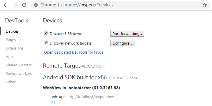
应用程序在Android设备或模拟器上运行时,就可以通过Chrome DevTools进行调试。
Chrome具有针对Android模拟器和设备的网络开发者工具支持,在模拟器正在运行或设备已连接到计算机的情况下,在Chrome中访问chrome://inspect,然后点击inspect在新窗口打开Chrome开发工具来调试的应用。
备注:我在测试时报HTTP/1.1 404 Not Found的错误,查阅资料是无法连接导致的,可能需要Over the wall。
6、日志
可以使用adb logcat查看日志,如果是使用Android Studio运行,可以在Logcat中查看本地日志。
四、UI组件
本篇只介绍Ionic在React的实现,对应官网链接:UI Components。
1、应用(ion-app)
App是Ionic应用程序的容器元素,每个项目应该只有一个<ion-app>元素。一个应用程序可以包含许多Ionic组件,包括菜单、标题、内容和页脚,遮罩层组件在显示时会附加到<ion-app>上。
React:
import { IonApp } from '@ionic/react';

<IonApp>
	...
</IonApp>
2、路由(Routing)
- ion-router
应用程序应该在代码库中有一个单独的ion-router组件,该组件控制与浏览器历史记录的所有交互,并通过事件系统聚合更新。
ion-router只是一个Ionic导航(ion-nav和ion-tabs)的URL协调器,意味着ion-router从不接触DOM,它不显示组件或发出任何类型的生命周期事件,只是告诉ion-nav和ion-tabs什么时候根据浏览器的URL”显示”。
HTML:
<ion-router>
	<ion-route component="page-tabs">
		<ion-route url="/map" component="page-map"></ion-route>
		<ion-route url="/about" component="page-about"></ion-route>
	</ion-route>

	<ion-route url="/signup" component="page-signup"></ion-route>
	<ion-route url="/support" component="page-support"></ion-route>
</ion-router>
- ion-route-redirect
路由重定向将一个URL重定向到另一个URL,它只能与ion-router一起使用,作为它的直接子元素。
HTML:
<ion-router>
	<ion-route-redirect from="/admin" to="/login"></ion-route-redirect>
	<ion-route-redirect from="/login" to="/admin"></ion-route-redirect>
</ion-router>
- ion-router-link
路由器链接组件用于导航到指定的链接,类似于浏览器的锚标记,它可以设置指向某个地址的href属性和转换动画的方向。
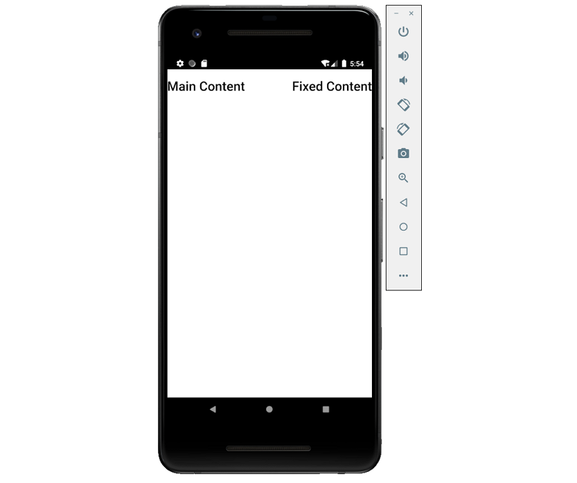
3、ion-content
内容(content)组件提供了一个易于使用的内容区域,并提供了一些有用的方法来控制可滚动区域。在单个视图(view)中应该只有一个内容(content)。
可以通过设置元素的slot属性为fixed来将元素置于可滚动区域之外,这会将元素绝对定位到左上角;可以使用top、right、bottom和left对元素进行样式设置将其置于不同的位置。
Content以及其他大部分Ionic组件可以自定义修改其padding、margin等CSS样式。
import React from 'react';
import { IonPage, IonContent } from '@ionic/react';

const ContentExample: React.FC = () => (
	<IonPage>
		<IonContent scrollEvents={true} onIonScrollStart={() => {}} onIonScroll={() => {}} onIonScrollEnd={() => {}}>
			<h1>Main Content</h1>

			<div slot="fixed" style={ {right:0} }>
				<h1>Fixed Content</h1>
			</div>
		</IonContent>
	</IonPage>
);

export default ContentExample;
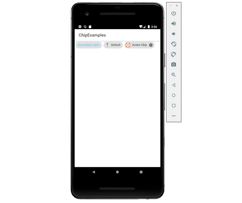
4、ion-chip
Chips表示小块中的复杂实体,一个Chip中可以包含多个不同的元素,例如:头像、文字和图标。
import React from 'react';
import { IonPage, IonHeader, IonToolbar, IonTitle, IonContent, IonChip, IonLabel, IonIcon, IonAvatar } from '@ionic/react';
import { pin, closeCircle } from 'ionicons/icons';

const ChipExamples: React.FC = () => {
	return (
		<IonPage>
			<IonHeader>
				<IonToolbar>
					<IonTitle>ChipExamples</IonTitle>
				</IonToolbar>
			</IonHeader>
			<IonContent>
				<IonChip>
					<IonLabel color="secondary">Secondary Label</IonLabel>
				</IonChip>

				<IonChip>
					<IonIcon icon={pin} />
					<IonLabel>Default</IonLabel>
				</IonChip>

				<IonChip>
					<IonAvatar>
						<img src="https://gravatar.com/avatar/dba6bae8c566f9d4041fb9cd9ada7741?d=identicon&f=y" />
					</IonAvatar>
					<IonLabel>Avatar Chip</IonLabel>
					<IonIcon icon={closeCircle} />
				</IonChip>
			</IonContent>
		</IonPage>
	);
};

export default ChipExamples;
5、文本(text)
文本ion-text组件是一个简单的组件,可用于对任何元素的文本设置颜色样式。
HTML:
<ion-text color="secondary">
  <h1>H1: The quick brown fox jumps over the lazy dog</h1>
</ion-text>

<ion-text color="danger">
  <h4 >H4: The quick brown fox jumps over the lazy dog</h4>
</ion-text>

<p>
  I saw a werewolf with a Chinese menu in his hand.
  Walking through the <ion-text color="danger"><sub>streets</sub></ion-text> of Soho in the rain.
  He <ion-text color="primary"><i>was</i></ion-text> looking for a place called Lee Ho Fook's.
  Gonna get a <ion-text color="secondary"><a>big dish of beef chow mein.</a></ion-text>
  <ion-text color="danger"><ion-icon name="cut"></ion-icon></ion-text>
</p>
6、图标(Icon)
Ionic提供了高级设计的图标,可用于Web、iOS、Android和桌面应用程序,支持SVG和Web字体。
HTML:
<ion-icon name="power-outline"></ion-icon>
React:
import { closeCircle } from 'ionicons/icons';

<IonIcon icon={closeCircle} />
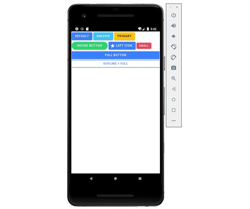
7、按钮(Button)
按钮ion-button提供了一个可点击的元素,可以在表单中使用,也可以在任何需要标准按钮功能的地方使用;可以显示文本、图标,或者两者都显示。
import React from 'react';

import { IonButton, IonIcon, IonContent, IonPage } from '@ionic/react';
import { star } from 'ionicons/icons';

const ButtonExample: React.FC = () => (
	<IonPage>
		<IonContent>
			{/*-- Default --*/}
		    <IonButton>Default</IonButton>

		    {/*-- Anchor --*/}
		    <IonButton color="secondary" href="#">Anchor</IonButton>

		    {/*-- Colors --*/}
		    <IonButton color="warning">Primary</IonButton>

			{/*-- Round --*/}
		    <IonButton color="success" shape="round">Round Button</IonButton>

			{/*-- Icons --*/}
		    <IonButton>
				<IonIcon slot="start" icon={star} />
				Left Icon
		    </IonButton>

			{/*-- Sizes --*/}
		    <IonButton color="danger" size="small">Small</IonButton>

		    {/*-- Expand --*/}
		    <IonButton expand="full">Full Button</IonButton>

			{/*-- Fill --*/}
		    <IonButton expand="full" fill="outline">Outline + Full</IonButton>
		</IonContent>
	</IonPage>
);

export default ButtonExample;
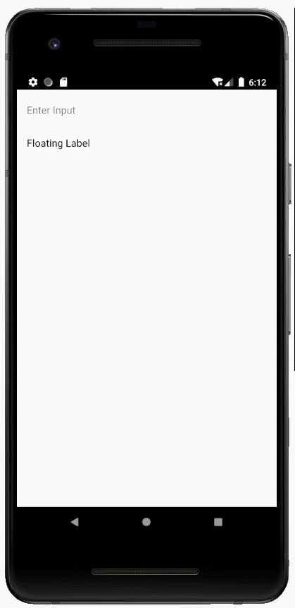
8、输入(Input)
- ion-input
Input组件是对HTML input元素的包装,可以使用大部分与HTML input相同的属性。它仅用于文本类型的输入,如 text、password、email、number、search、tel和url;支持所有标准的文本输入事件,包括keyup、keydown和keypress等。
import React, { useState } from 'react';
import { IonPage, IonContent, IonList, IonInput, IonItem, IonLabel } from '@ionic/react';

const InputExample: React.FC = () => {

	const [text, setText] = useState<string>();

	return (
		<IonPage>
			<IonContent>
				<IonList>
					<IonItem>
						<IonInput value={text} placeholder="Enter Input" onIonChange={e => setText(e.detail.value!)}></IonInput>
					</IonItem>

					<IonItem>
						<IonLabel position="floating">Floating Label</IonLabel>
						<IonInput value={text}></IonInput>
					</IonItem>
				</IonList>
			</IonContent>
		</IonPage>
	);
};

export default InputExample;
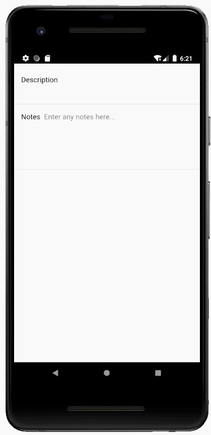
- ion-textarea
Textarea组件用于多行文本输入,其值应该设置在value属性中。
import React, { useState } from 'react';
import { IonPage, IonContent, IonList, IonTextarea, IonItem, IonLabel } from '@ionic/react';

const TextareaExample: React.FC = () => {

	const [text, setText] = useState<string>();

	return (
		<IonPage>
			<IonContent>
				<IonList>
					<IonItem>
						<IonLabel position="floating">Description</IonLabel>
						<IonTextarea value={text} onIonChange={e => setText(e.detail.value!)}></IonTextarea>
					</IonItem>

					<IonItem>
						<IonLabel>Notes</IonLabel>
						<IonTextarea rows={6} cols={20} placeholder="Enter any notes here..." value={text} onIonChange={e => setText(e.detail.value!)}></IonTextarea>
					</IonItem>
				</IonList>
			</IonContent>
		</IonPage>
	);
};

export default TextareaExample;
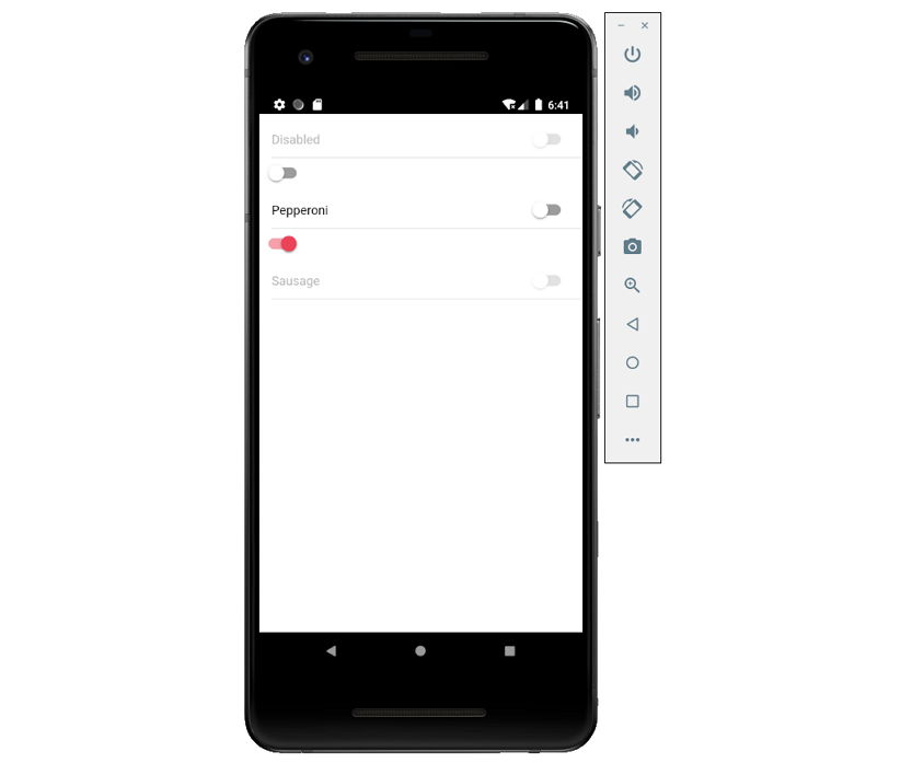
9、ion-toggle
切换(toggle)组件可更改单个选项的状态,(切换)开关可以通过按下或滑动来开启或关闭。
import React, { useState } from 'react';
import { IonPage, IonContent, IonList, IonToggle, IonItem, IonLabel } from '@ionic/react';

const ToggleExample: React.FC = () => {

	const [checked, setChecked] = useState(false);

	return (
		<IonPage>
			<IonContent>
				<IonList>
					<IonItem>
						<IonLabel>Disabled</IonLabel>
						<IonToggle disabled />
					</IonItem>

					<IonToggle checked={checked} onIonChange={e => setChecked(e.detail.checked)} />

					<IonItem>
						<IonLabel>Pepperoni</IonLabel>
						<IonToggle value="pepperoni" checked={checked}/>
					</IonItem>

					<IonToggle color="danger" checked={true}/>

					<IonItem>
						<IonLabel>Sausage</IonLabel>
						<IonToggle value="sausage" disabled={true} />
					</IonItem>
				</IonList>
			</IonContent>
		</IonPage>
	);
};

export default ToggleExample;
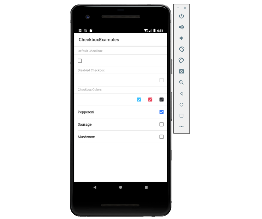
10、复选框
复选框ion-checkbox允许从一组选项中选择多个选项,它们在激活时显示为勾选状态;点击复选框将切换选中的属性。
import React, { useState } from 'react';
import { IonContent, IonHeader, IonPage, IonTitle, IonToolbar, IonCheckbox, IonList, IonItem, IonLabel, IonItemDivider } from '@ionic/react';

const checkboxList = [
	{ val: 'Pepperoni', isChecked: true },
	{ val: 'Sausage', isChecked: false },
	{ val: 'Mushroom', isChecked: false }
];

export const CheckboxExamples: React.FC = () => {

  const [checked, setChecked] = useState(false);

	return (
		<IonPage>
			<IonHeader>
				<IonToolbar>
					<IonTitle>CheckboxExamples</IonTitle>
				</IonToolbar>
			</IonHeader>
			<IonContent>
				<IonList>
					<IonItemDivider>Default Checkbox</IonItemDivider>
					<IonItem><IonCheckbox checked={checked} onIonChange={e => setChecked(e.detail.checked)} /></IonItem>

					<IonItemDivider>Disabled Checkbox</IonItemDivider>
			        <IonItem><IonCheckbox slot="end" disabled={true} /></IonItem>

					<IonItemDivider>Checkbox Colors</IonItemDivider>
					<IonItem>
						<IonCheckbox slot="end" color="secondary" checked/>
						<IonCheckbox slot="end" color="danger" checked/>
						<IonCheckbox slot="end" color="dark" checked/>
					</IonItem>

					{checkboxList.map(({ val, isChecked }, i) => (
						<IonItem key={i}>
							<IonLabel>{val}</IonLabel>
							<IonCheckbox slot="end" value={val} checked={isChecked} />
						</IonItem>
					))}
				</IonList>
			</IonContent>
		</IonPage>
	);
};

export default CheckboxExamples;
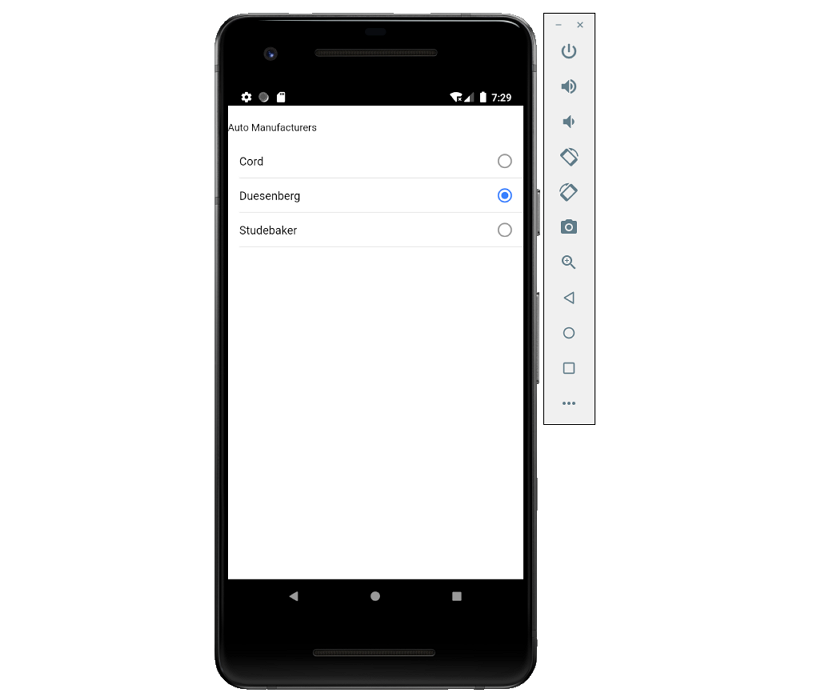
11、单选按钮(组)
单选按钮ion-radio与单选按钮组ion-radio-group。
import React from 'react';
import { IonList, IonRadioGroup, IonListHeader, IonLabel, IonRadio, IonItem, IonContent, IonPage } from '@ionic/react';

const RadioExample: React.FC = () => (
	<IonPage>
		<IonContent>
			<IonList>
				<IonRadioGroup value="duesenberg">
					<IonListHeader>
						<IonLabel>Auto Manufacturers</IonLabel>
					</IonListHeader>

					<IonItem>
						<IonLabel>Cord</IonLabel>
						<IonRadio value="cord" />
					</IonItem>

					<IonItem>
						<IonLabel>Duesenberg</IonLabel>
						<IonRadio value="duesenberg" />
					</IonItem>

					<IonItem>
						<IonLabel>Studebaker</IonLabel>
						<IonRadio value="studebaker" />
					</IonItem>
				</IonRadioGroup>
			</IonList>
		</IonContent>
	</IonPage>
);

export default RadioExample;
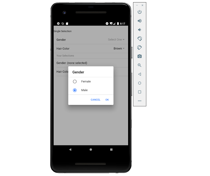
12、选择框
选择框ion-select用于从一组选项中选择一个或多个选项,它可以包含ion-select-option子元素;如果子选项没有赋值value属性,那么它的文本将被用作值。
- 单选
import React, { useState } from 'react';
import { IonContent, IonItem, IonLabel, IonList, IonListHeader, IonSelect, IonSelectOption, IonPage, IonItemDivider } from '@ionic/react';

const SelectExample: React.FC = () => {

	const [gender, setGender] = useState<string>();
  	const [hairColor, setHairColor] = useState<string>('brown');

	return (
		<IonPage>
			<IonContent>
				<IonList>
					<IonListHeader>
						<IonLabel>Single Selection</IonLabel>
					</IonListHeader>

					<IonItem>
						<IonLabel>Gender</IonLabel>
						<IonSelect value={gender} placeholder="Select One" onIonChange={e => setGender(e.detail.value)}>
							<IonSelectOption value="female">Female</IonSelectOption>
							<IonSelectOption value="male">Male</IonSelectOption>
						</IonSelect>
					</IonItem>

					<IonItem>
						<IonLabel>Hair Color</IonLabel>
						<IonSelect value={hairColor} okText="Okay" cancelText="Dismiss" onIonChange={e => setHairColor(e.detail.value)}>
							<IonSelectOption value="brown">Brown</IonSelectOption>
							<IonSelectOption value="blonde">Blonde</IonSelectOption>
							<IonSelectOption value="black">Black</IonSelectOption>
							<IonSelectOption value="red">Red</IonSelectOption>
						</IonSelect>
					</IonItem>
					<IonItemDivider>Your Selections</IonItemDivider>
					<IonItem>Gender: {gender ?? '(none selected)'}</IonItem>
					<IonItem>Hair Color: {hairColor}</IonItem>
				</IonList>
			</IonContent>
		</IonPage>
	);
};

export default SelectExample;
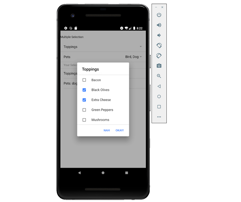
- 多选
import React, { useState } from 'react';
import { IonContent, IonItem, IonLabel, IonList, IonListHeader, IonSelect, IonSelectOption, IonPage, IonItemDivider } from '@ionic/react';

const MultiSelectExample: React.FC = () => {

	const [toppings, setToppings] = useState<string[]>([]);
  	const [pets, setPets] = useState<string[]>(['bird', 'dog']);

	return (
		<IonPage>
			<IonContent>
				<IonList>
					<IonListHeader>
						<IonLabel>Multiple Selection</IonLabel>
					</IonListHeader>

					<IonItem>
						<IonLabel>Toppings</IonLabel>
						<IonSelect value={toppings} multiple={true} cancelText="Nah" okText="Okay!" onIonChange={e => setToppings(e.detail.value)}>
							<IonSelectOption value="bacon">Bacon</IonSelectOption>
							<IonSelectOption value="olives">Black Olives</IonSelectOption>
							<IonSelectOption value="xcheese">Extra Cheese</IonSelectOption>
							<IonSelectOption value="peppers">Green Peppers</IonSelectOption>
							<IonSelectOption value="mushrooms">Mushrooms</IonSelectOption>
						</IonSelect>
					</IonItem>

					<IonItem>
						<IonLabel>Pets</IonLabel>
						<IonSelect multiple={true} value={pets} onIonChange={e => setPets(e.detail.value)}>
							<IonSelectOption value="bird">Bird</IonSelectOption>
							<IonSelectOption value="cat">Cat</IonSelectOption>
							<IonSelectOption value="dog">Dog</IonSelectOption>
							<IonSelectOption value="honeybadger">Honey Badger</IonSelectOption>
						</IonSelect>
					</IonItem>
					<IonItemDivider>Your Selections</IonItemDivider>
					<IonItem>Toppings: {toppings.length ? toppings.reduce((curr, prev) => prev + ', ' + curr, '') : '(none selected)'}</IonItem>
					<IonItem>Pets: {pets.length ? pets.reduce((curr, prev) => prev + ', ' + curr, '') : '(none selected)'}</IonItem>
				</IonList>
			</IonContent>
		</IonPage>
	);
};

export default MultiSelectExample;
13、选择器
选择器(ion-picker)是一个对话框,它在下方显示一行按钮和列;它出现在应用程序的内容顶部和视口的底部。
HTML:
<ion-app>
	<ion-header translucent>
		<ion-toolbar>
			<ion-title>Picker</ion-title>
		</ion-toolbar>
	</ion-header>

	<ion-content fullscreen class="ion-padding">
		<ion-button expand="block" onclick="openPicker()">Show Single Column Picker</ion-button>
		<ion-button expand="block" onclick="openPicker(2, 5, multiColumnOptions)">Show Multi Column Picker</ion-button>
	</ion-content>
</ion-app>
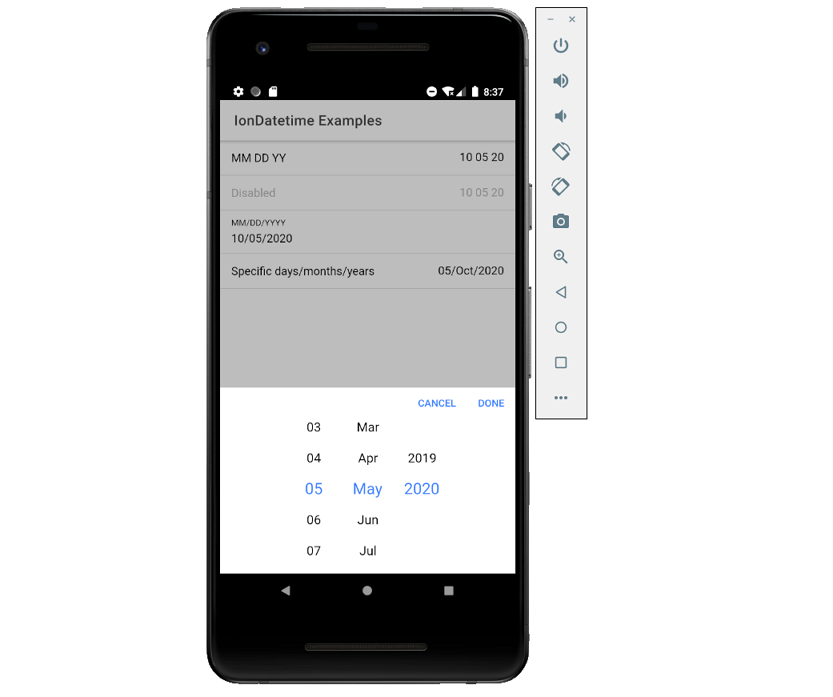
14、日期时间
日期时间控件从页面底部显示一个选择器界面,使用户可以轻松地选择日期和时间。选择器中显示可滚动的列,可用于单独选择年、月、日、小时和分钟的值。
- ion-datetime
import React, { useState } from 'react';
import { IonContent, IonHeader, IonPage, IonTitle, IonToolbar, IonItem, IonLabel, IonDatetime, IonFooter } from '@ionic/react';

const customYearValues = [2020, 2016, 2008, 2004, 2000, 1996];

const DateTimeExamples: React.FC = () => {

	const [selectedDate, setSelectedDate] = useState<string>('2020-10-05T15:20:25.789');

	return (
		<IonPage>
			<IonHeader>
				<IonToolbar>
					<IonTitle>IonDatetime Examples</IonTitle>
				</IonToolbar>
			</IonHeader>
			<IonContent>
				<IonItem>
					<IonLabel>MM DD YY</IonLabel>
					<IonDatetime displayFormat="MM DD YY" placeholder="Select Date" value={selectedDate} onIonChange={e => setSelectedDate(e.detail.value!)}></IonDatetime>
				</IonItem>

				<IonItem>
					<IonLabel>Disabled</IonLabel>
					<IonDatetime id="dynamicDisabled" displayFormat="MM DD YY" disabled value={selectedDate} onIonChange={e => setSelectedDate(e.detail.value!)}></IonDatetime>
				</IonItem>

				<IonItem>
					<IonLabel position="floating">MM/DD/YYYY</IonLabel>
					<IonDatetime displayFormat="MM/DD/YYYY" min="1980-01-01" max="2025-12-31" value={selectedDate} onIonChange={e => setSelectedDate(e.detail.value!)}></IonDatetime>
				</IonItem>

				<IonItem>
					<IonLabel>Specific days/months/years</IonLabel>
					<IonDatetime
						monthValues='3,4,5,6,7,8'
						yearValues='2019,2020'
						dayValues="01, 02, 03, 04, 05, 06, 07, 08, 09, 10, 15, 20, 25"
						displayFormat="DD/MMM/YYYY"
						value={selectedDate} onIonChange={e => setSelectedDate(e.detail.value!)}
					></IonDatetime>
				</IonItem>
			</IonContent>
			<IonFooter>
				<IonToolbar>Selected Date: {selectedDate ?? '(none)'}</IonToolbar>
			</IonFooter>
		</IonPage>
	);
};

export default DateTimeExamples;
15、探索栏
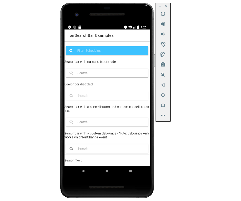
Searchbars表示可用于搜索整个集合的文本字段,可以显示在工具栏toolbar中或main content里。
import React, { useState } from 'react';
import { IonContent, IonHeader, IonPage, IonTitle, IonToolbar, IonSearchbar, IonFooter } from '@ionic/react';

const SearchBarExamples: React.FC = () => {

	const [searchText, setSearchText] = useState('');

	return (
		<IonPage>
			<IonHeader>
				<IonToolbar>
					<IonTitle>IonSearchBar Examples</IonTitle>
				</IonToolbar>
			</IonHeader>
			<IonContent>
				<p>Searchbar in a Toolbar</p>
		        <IonToolbar>
					<IonSearchbar value={searchText} color="secondary" placeholder="Filter Schedules" onIonChange={e => setSearchText(e.detail.value!)}></IonSearchbar>
		        </IonToolbar>

		        <p>Searchbar with numeric inputmode</p>
		        <IonSearchbar value={searchText} onIonChange={e => setSearchText(e.detail.value!)} inputmode="numeric"></IonSearchbar>

		        <p>Searchbar disabled </p>
		        <IonSearchbar value={searchText} onIonChange={e => setSearchText(e.detail.value!)} disabled={true}></IonSearchbar>

		        <p>Searchbar with a cancel button and custom cancel button text</p>
		        <IonSearchbar value={searchText} onIonChange={e => setSearchText(e.detail.value!)} showCancelButton="focus" cancelButtonText="Custom Cancel"></IonSearchbar>

		        <p>Searchbar with a custom debounce - Note: debounce only works on onIonChange event</p>
		        <IonSearchbar value={searchText} onIonChange={e => setSearchText(e.detail.value!)} debounce={1000}></IonSearchbar>
			</IonContent>
			<IonFooter>
				<IonToolbar>
					Search Text: {searchText ?? '(none)'}
				</IonToolbar>
			</IonFooter>
		</IonPage>
	);
};

export default SearchBarExamples;
16、项目(Item)
- ion-label
标签是一个可以与ion-item、ion-input、ion-toggle等元素结合使用的包装器元素。Label在Item内部的位置可以是内嵌的、固定的、堆叠的或浮动的。
import { IonItem, IonContent, IonLabel, IonInput } from '@ionic/react';

<IonContent>
	{/*-- Default Label --*/}
	<IonLabel>Label</IonLabel>

	{/*-- Label Colors --*/}
	<IonLabel color="primary">Primary Label</IonLabel>

	{/*-- Input Labels --*/}
    <IonItem>
		<IonLabel>Default Input</IonLabel>
		<IonInput></IonInput>
    </IonItem>
</IonContent>
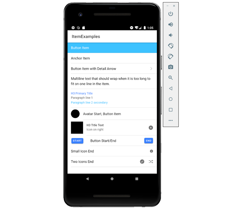
- ion-item
Item是可以包含文本、图标、头像、输入框和任何其他本地元素或自定义元素的元素。一般来说,它们与其他项目一起放在一个列表中;项目可以滑动、删除、重新排序、编辑等。
import React from 'react';
import { IonContent, IonHeader, IonPage, IonTitle, IonToolbar, IonItem, IonLabel, IonText, IonAvatar, IonThumbnail, IonButton, IonIcon } from '@ionic/react';
import { closeCircle, informationCircle, checkmarkCircle, shuffle } from 'ionicons/icons';

const ItemExample: React.FC = () => {

	return (
		<IonPage>
			<IonHeader>
				<IonToolbar>
					<IonTitle>ItemExamples</IonTitle>
				</IonToolbar>
			</IonHeader>

			<IonContent>
				{/*-- Item as a Button --*/}
				<IonItem button onClick={() => { }} color="secondary">
					<IonLabel>Button Item</IonLabel>
				</IonItem>

				{/*-- Item as an Anchor --*/}
				<IonItem href="https://www.ionicframework.com">
					<IonLabel>Anchor Item</IonLabel>
				</IonItem>

				{/*-- Detail Arrows --*/}
				<IonItem button onClick={() => { }} detail>
					<IonLabel>Button Item with Detail Arrow</IonLabel>
				</IonItem>

				<IonItem>
					<IonLabel className="ion-text-wrap">
						Multiline text that should wrap when it is too long
						to fit on one line in the item.
					</IonLabel>
				</IonItem>

				<IonItem>
					<IonLabel className="ion-text-wrap">
						<IonText color="primary"><h3>H3 Primary Title</h3></IonText>
						<p>Paragraph line 1</p>
						<IonText color="secondary">
							<p>Paragraph line 2 secondary</p>
						</IonText>
					</IonLabel>
				</IonItem>

				<IonItem button onClick={() => { }}>
					<IonAvatar slot="start">
						<img src="data:image/gif;base64,R0lGODlhAQABAIAAAAAAAAAAACH5BAAAAAAALAAAAAABAAEAAAICTAEAOw==" />
					</IonAvatar>
					<IonLabel>Avatar Start, Button Item</IonLabel>
				</IonItem>

				<IonItem button onClick={() => { }}>
					<IonThumbnail slot="start">
						<img src="data:image/gif;base64,R0lGODlhAQABAIAAAAAAAAAAACH5BAAAAAAALAAAAAABAAEAAAICTAEAOw==" />
					</IonThumbnail>
					<IonLabel><h3>H3 Title Text</h3>
					<p>Icon on right</p></IonLabel><IonIcon icon={closeCircle} slot="end" />
				</IonItem>

				{/*-- Buttons in Items --*/}
				<IonItem>
					<IonButton slot="start">Start</IonButton>
					<IonLabel>Button Start/End</IonLabel>
					<IonButton slot="end">End</IonButton>
				</IonItem>

				<IonItem>
					<IonLabel>Small Icon End</IonLabel>
					<IonIcon icon={informationCircle} size="small" slot="end" />
				</IonItem>

				<IonItem>
					<IonLabel>Two Icons End</IonLabel>
					<IonIcon icon={checkmarkCircle} slot="end" />
					<IonIcon icon={shuffle} slot="end" />
				</IonItem>
			</IonContent>
		</IonPage>
	);
};

export default ItemExample;
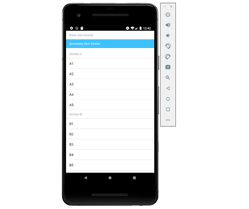
- ion-item-divider
项目分隔符是块元素,可用于分隔列表中的项。
import React from 'react';
import { IonPage, IonItemDivider, IonLabel, IonList, IonItem, IonContent } from '@ionic/react';

const ItemDividerExample: React.FC = () => {

	return (
		<IonPage>
			<IonContent>
				<IonItemDivider>
					<IonLabel>Basic Item Divider</IonLabel>
				</IonItemDivider>

				<IonItemDivider color="secondary">
					<IonLabel>Secondary Item Divider</IonLabel>
				</IonItemDivider>

				{/*-- Item Dividers in a List --*/}
				<IonList>
					<IonItemDivider>
						<IonLabel>Section A</IonLabel>
					</IonItemDivider>

					<IonItem><IonLabel>A1</IonLabel></IonItem>
					<IonItem><IonLabel>A2</IonLabel></IonItem>
					<IonItem><IonLabel>A3</IonLabel></IonItem>
					<IonItem><IonLabel>A4</IonLabel></IonItem>
					<IonItem><IonLabel>A5</IonLabel></IonItem>

					<IonItemDivider>
						<IonLabel>Section B</IonLabel>
					</IonItemDivider>

					<IonItem><IonLabel>B1</IonLabel></IonItem>
					<IonItem><IonLabel>B2</IonLabel></IonItem>
					<IonItem><IonLabel>B3</IonLabel></IonItem>
					<IonItem><IonLabel>B4</IonLabel></IonItem>
					<IonItem><IonLabel>B5</IonLabel></IonItem>
				</IonList>
			</IonContent>
		</IonPage>
	);
};

export default ItemDividerExample;
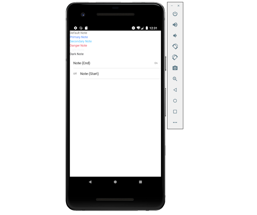
- ion-note
注释是文本元素,通常用作副标题来提供更多信息。默认情况下,注释的样式为灰色。
import React from 'react';
import { IonPage, IonNote, IonList, IonItem, IonLabel, IonContent } from '@ionic/react';

const NoteExample: React.FC = () => {

	return (
		<IonPage>
			<IonContent>
				{/*-- Default Note --*/}
				<IonNote>Default Note</IonNote><br />

				{/*-- Note Colors --*/}
				<IonNote color="primary">Primary Note</IonNote><br />
				<IonNote color="secondary">Secondary Note</IonNote><br />
				<IonNote color="danger">Danger Note</IonNote><br />
				<IonNote color="light">Light Note</IonNote><br />
				<IonNote color="dark">Dark Note</IonNote><br />

				{/*-- Notes in a List --*/}
				<IonList>
					<IonItem>
						<IonLabel>Note (End)</IonLabel>
						<IonNote slot="end">On</IonNote>
					</IonItem>

					<IonItem>
						<IonNote slot="start">Off</IonNote>
						<IonLabel>Note (Start)</IonLabel>
					</IonItem>
				</IonList>
			</IonContent>
		</IonPage>
	);
};

export default NoteExample;
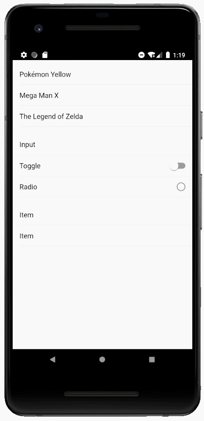
17、列表(List)
- ion-list
列表ion-list由多行Item组成,可以包含文本、按钮、图标、缩略图等。列表通常包含具有相似数据内容的项目,例如图像和文本。
import React from 'react';
import { IonPage, IonList, IonItem, IonLabel, IonInput, IonToggle, IonRadio, IonCheckbox, IonItemSliding, IonItemOption, IonItemOptions, IonContent } from '@ionic/react';

const ListExample: React.FC = () => {

	return (
		<IonPage>
			<IonContent>
				{/*-- List of Text Items --*/}
				<IonList>
					<IonItem>
						<IonLabel>Pokémon Yellow</IonLabel>
					</IonItem>
					<IonItem>
						<IonLabel>Mega Man X</IonLabel>
					</IonItem>
					<IonItem>
						<IonLabel>The Legend of Zelda</IonLabel>
					</IonItem>
				</IonList>

				{/*-- List of Input Items --*/}
				<IonList>
					<IonItem>
						<IonLabel>Input</IonLabel>
						<IonInput></IonInput>
					</IonItem>
					<IonItem>
						<IonLabel>Toggle</IonLabel>
						<IonToggle slot="end"></IonToggle>
					</IonItem>
					<IonItem>
						<IonLabel>Radio</IonLabel>
						<IonRadio slot="end"></IonRadio>
					</IonItem>
				</IonList>

				{/*-- List of Sliding Items --*/}
				<IonList>
					<IonItemSliding>
						<IonItem>
							<IonLabel>Item</IonLabel>
						</IonItem>
						<IonItemOptions side="end">
							<IonItemOption onClick={() => {}}>Unread</IonItemOption>
						</IonItemOptions>
					</IonItemSliding>

					<IonItemSliding>
						<IonItem>
							<IonLabel>Item</IonLabel>
						</IonItem>
						<IonItemOptions side="end">
							<IonItemOption onClick={() => {}}>Unread</IonItemOption>
						</IonItemOptions>
					</IonItemSliding>
				</IonList>
			</IonContent>
		</IonPage>
	);
};

export default ListExample;
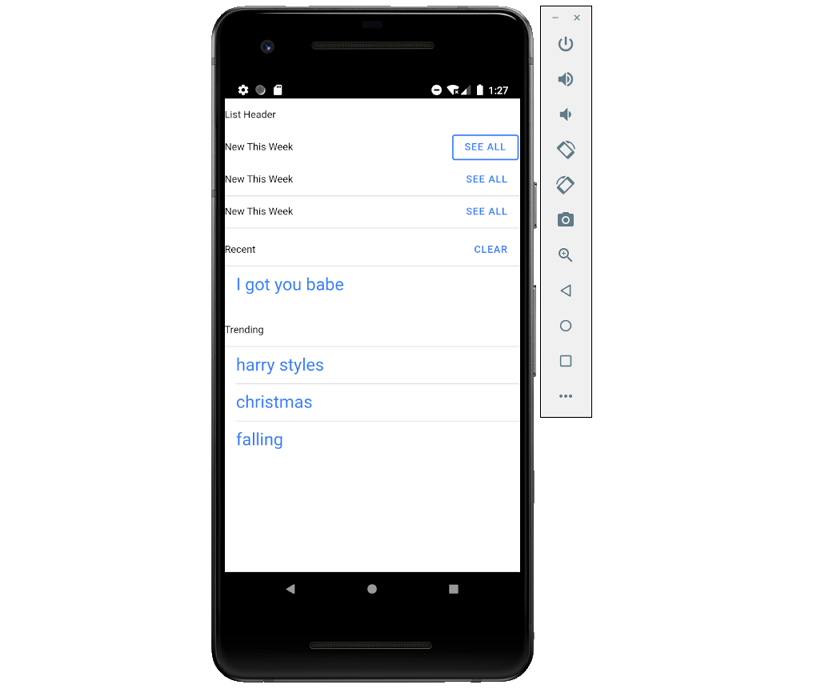
- ion-list-header
ion-list-header组件是列表的头部组件,与ItemDivider不同,ListHeaders被设计成与其他列表项目不同的样式。
import React from 'react';
import { IonPage, IonButton, IonContent, IonItem, IonLabel, IonList, IonListHeader } from '@ionic/react';

const ListHeaderExample: React.FC = () => {

	return (
		<IonPage>
			<IonContent>
				{/*-- Default List Header --*/}
				<IonListHeader>
					<IonLabel>List Header</IonLabel>
				</IonListHeader>


				{/*-- List Header with Outline Button --*/}
				<IonListHeader>
					<IonLabel>New This Week</IonLabel>
					<IonButton fill="outline">See All</IonButton>
				</IonListHeader>

				{/*-- List Header Full Lines --*/}
				<IonListHeader lines="full">
					<IonLabel>New This Week</IonLabel>
					<IonButton>See All</IonButton>
				</IonListHeader>

				{/*-- List Header Inset Lines --*/}
				<IonListHeader lines="inset">
					<IonLabel>New This Week</IonLabel>
					<IonButton>See All</IonButton>
				</IonListHeader>

				{/*-- List Headers in Lists --*/}
				<IonList>
					<IonListHeader lines="inset">
						<IonLabel>Recent</IonLabel>
						<IonButton>Clear</IonButton>
					</IonListHeader>
					<IonItem lines="none">
						<IonLabel color="primary">
							<h1>I got you babe</h1>
						</IonLabel>
					</IonItem>
				</IonList>

				<IonList>
					<IonListHeader lines="inset">
						<IonLabel>Trending</IonLabel>
					</IonListHeader>
					<IonItem>
						<IonLabel color="primary">
							<h1>harry styles</h1>
						</IonLabel>
					</IonItem>
					<IonItem>
						<IonLabel color="primary">
							<h1>christmas</h1>
						</IonLabel>
					</IonItem>
					<IonItem lines="none">
						<IonLabel color="primary">
							<h1>falling</h1>
						</IonLabel>
					</IonItem>
				</IonList>
			</IonContent>
		</IonPage>
	);
};

export default ListHeaderExample;
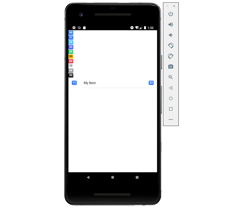
18、徽章(Badge)
徽章(ion-badge)是通常出现在另一个元素附近的内嵌块元素,一般包含一个数字或其他字符,可以用作一种通知来表示与某个元素关联的其他项,并指示有多少个。
import React from 'react';
import { IonPage, IonBadge, IonItem, IonLabel, IonContent } from '@ionic/react';

const BadgeExample: React.FC = () => {

	return (
		<IonPage>
			<IonContent>
				{/*-- Default --*/}
				<IonBadge>99</IonBadge><br/>

				{/*-- Colors --*/}
				<IonBadge color="primary">11</IonBadge><br/>
				<IonBadge color="secondary">22</IonBadge><br/>
				<IonBadge color="tertiary">33</IonBadge><br/>
				<IonBadge color="success">44</IonBadge><br/>
				<IonBadge color="warning">55</IonBadge><br/>
				<IonBadge color="danger">66</IonBadge><br/>
				<IonBadge color="light">77</IonBadge><br/>
				<IonBadge color="medium">88</IonBadge><br/>
				<IonBadge color="dark">99</IonBadge>

				{/*-- Item with badge on left and right --*/}
				<IonItem>
					<IonBadge slot="start">11</IonBadge>
					<IonLabel>My Item</IonLabel>
					<IonBadge slot="end">22</IonBadge>
				</IonItem>
			</IonContent>
		</IonPage>
	);
};

export default BadgeExample;
19、工具栏
- ion-title
ion-title是设置工具栏标题的组件。
import React from 'react';
import { IonPage, IonContent, IonHeader, IonSearchbar, IonTitle, IonToolbar} from '@ionic/react';

const TitleExample: React.FC = () => {

	return (
		<IonPage>
			<IonHeader translucent>
				<IonToolbar>
					<IonTitle>Settings</IonTitle>
				</IonToolbar>
			</IonHeader>

			<IonContent>
				{/*-- Default title --*/}
				<IonToolbar>
					<IonTitle>Default Title</IonTitle>
				</IonToolbar>

				{/*-- Small title --*/}
				<IonToolbar>
					<IonTitle size="small">Small Title</IonTitle>
				</IonToolbar>

			</IonContent>
		</IonPage>
	);
};

export default TitleExample;

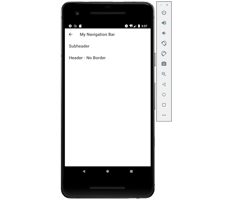
- ion-header
Header是可以存放工具栏组件的父组件,但是它必须是页面的三个根元素之一。
import React from 'react';
import { IonPage, IonHeader, IonContent, IonToolbar, IonButtons, IonBackButton, IonTitle } from '@ionic/react';

const HeaderExample: React.FC = () => {

	return (
		<IonPage>
			<IonHeader>
				<IonToolbar>
					<IonButtons slot="start">
						<IonBackButton defaultHref="/" />
					</IonButtons>
					<IonTitle>My Navigation Bar</IonTitle>
				</IonToolbar>

				<IonToolbar>
					<IonTitle>Subheader</IonTitle>
				</IonToolbar>
			</IonHeader>

			{/*-- Header without a border --*/}
			<IonHeader className="ion-no-border">
				<IonToolbar>
					<IonTitle>Header - No Border</IonTitle>
				</IonToolbar>
			</IonHeader>

			<IonContent>
				<IonHeader collapse="condense">
					<IonToolbar>
						<IonTitle size="large">My Navigation Bar</IonTitle>
					</IonToolbar>
				</IonHeader>
			</IonContent>
		</IonPage>
	);
};

export default HeaderExample;
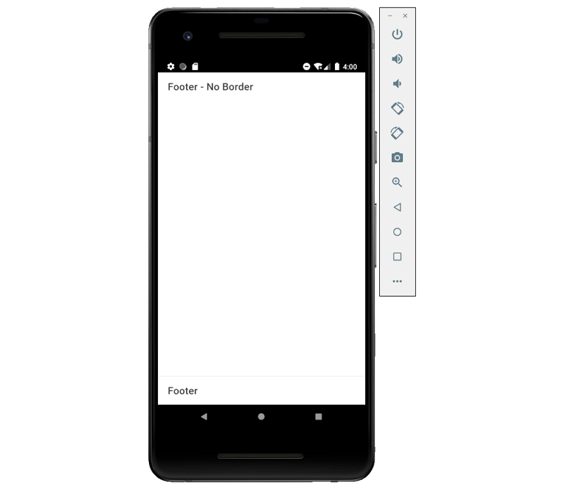
- ion-footer
页脚是位于页面底部的页面根组件,页脚可以用作工具栏的包装,以确保内容区域的大小正确。
import React from 'react';
import { IonPage, IonContent, IonFooter, IonToolbar, IonTitle } from '@ionic/react';

const FooterExample: React.FC = () => {

	return (
		<IonPage>
			{/*-- Footer without a border --*/}
			<IonFooter className="ion-no-border">
				<IonToolbar>
					<IonTitle>Footer - No Border</IonTitle>
				</IonToolbar>
			</IonFooter>

			<IonFooter>
				<IonToolbar>
					<IonTitle>Footer</IonTitle>
				</IonToolbar>
			</IonFooter>
		</IonPage>
	);
};

export default FooterExample;
- ion-buttons
ion-buttons组件是一个容器元素,放置在工具栏中的按钮应该放在<ion-buttons>元素中,可以使用插槽(slot)属性控制元素放置的位置。
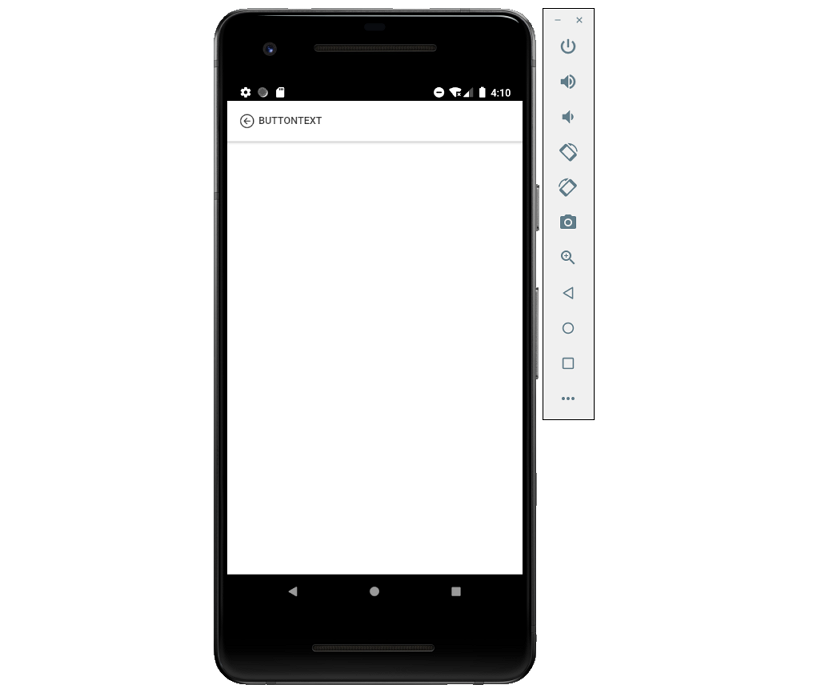
- ion-back-button
后退按钮可以在应用程序的历史记录中导航回来。
import React from 'react';
import { IonPage, IonBackButton, IonHeader, IonToolbar, IonButtons, IonMenuButton, IonContent } from '@ionic/react';
import { arrowBackCircleOutline } from 'ionicons/icons';

const BackButtonExample: React.FC = () => {

	return (
		<IonPage>
			{/*-- Back button with a default href 、custom text and icon --*/}
			<IonHeader>
				<IonToolbar>
					<IonButtons slot="start">
						<IonBackButton defaultHref="home" text="buttonText" icon={arrowBackCircleOutline}/>
					</IonButtons>
				</IonToolbar>
			</IonHeader>
		</IonPage>
	);
};

export default BackButtonExample;
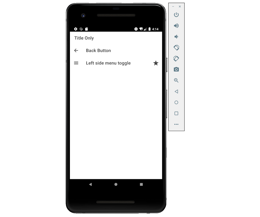
- ion-toolbar
工具栏位于内容(content)的上方或下方;当一个工具栏被放置在<ion-header>中时,它会出现在内容的顶部;当它在<ion-footer>中时,它会出现在底部;当放置在<ion-content>中时,工具栏会随着内容滚动。
import React from 'react';
import { IonPage, IonContent, IonToolbar, IonTitle, IonButtons, IonBackButton, IonMenuButton, IonButton, IonIcon } from '@ionic/react';
import { star } from 'ionicons/icons';

const ToolbarExample: React.FC = () => {

	return (
		<IonPage>
			<IonContent>
				<IonToolbar>
					<IonTitle>Title Only</IonTitle>
				</IonToolbar>

				<IonToolbar>
					<IonButtons slot="start">
						<IonBackButton defaultHref="/" />
					</IonButtons>
					<IonTitle>Back Button</IonTitle>
				</IonToolbar>

				<IonToolbar>
					<IonButtons slot="start">
						<IonMenuButton autoHide={false} />
					</IonButtons>
					<IonButtons slot="secondary">
						<IonButton>
							<IonIcon slot="icon-only" icon={star} />
						</IonButton>
					</IonButtons>
					<IonTitle>Left side menu toggle</IonTitle>
				</IonToolbar>
			</IonContent>
		</IonPage>
	);
};

export default ToolbarExample;
20、提示
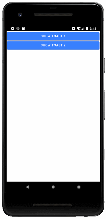
- ion-toast
Toast是现代应用程序中常用的一种通知,它可以用来提供关于操作的反馈或显示系统消息;它出现在应用程序的内容之上,并且可以被应用程序忽略以恢复用户与应用程序的互动。
Toast可以放在视窗的顶部、底部或中间,如果没有指定位置,将显示在底部。还可以通过duration属性设置持续时间。
import React, { useState } from 'react';
import { IonPage, IonToast, IonContent, IonButton } from '@ionic/react';

const ToastExample: React.FC = () => {

	const [showToast1, setShowToast1] = useState(false);
  	const [showToast2, setShowToast2] = useState(false);

	return (
		<IonPage>
			<IonContent>
				<IonButton onClick={() => setShowToast1(true)} expand="block">Show Toast 1</IonButton>
      			<IonButton onClick={() => setShowToast2(true)} expand="block">Show Toast 2</IonButton>

      			<IonToast
					isOpen={showToast1}
					onDidDismiss={() => setShowToast1(false)}
					message="Your settings have been saved."
					duration={200}
				/>

				<IonToast
					isOpen={showToast2}
					onDidDismiss={() => setShowToast2(false)}
					message="Click to Close"
					position="middle"
					buttons={[
						{
							side: 'start',
							icon: 'star',
							text: 'Favorite',
							handler: () => {
								console.log('Favorite clicked');
							}
						},
						{
							text: 'Done',
							role: 'cancel',
							handler: () => {
								console.log('Cancel clicked');
							}
						}
					]}
				/>
			</IonContent>
		</IonPage>
	);
};

export default ToastExample;
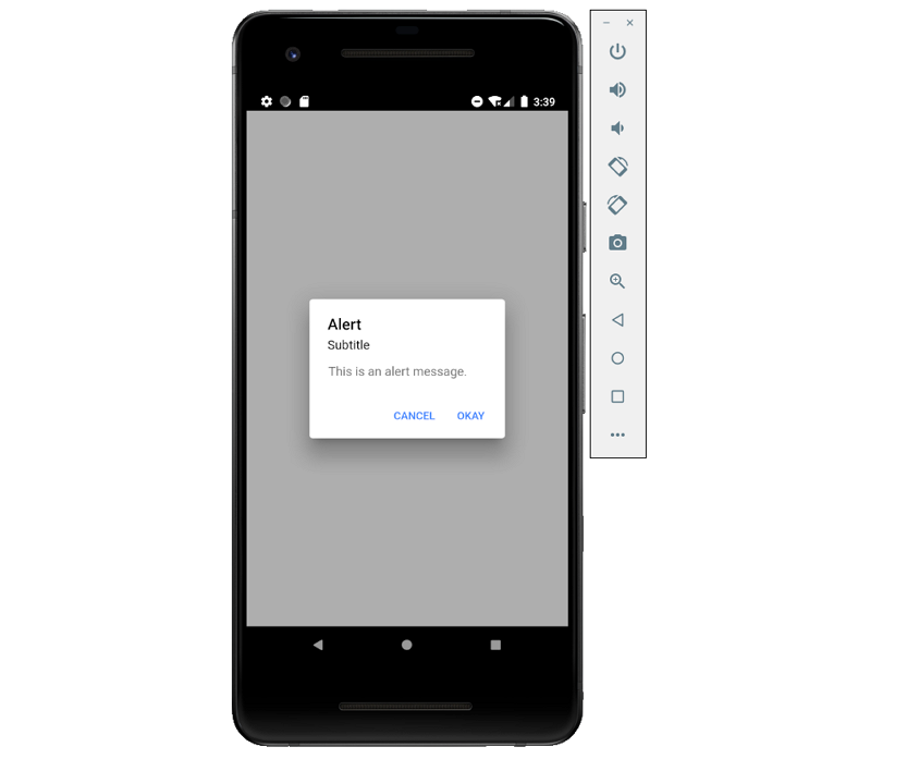
- ion-alert
Alert是一个对话框,它向用户提供信息或从用户的输入中收集信息;Alert会在应用程序的内容之上会出现一个提醒,用户必须手动操作使它消失,然后才能恢复与应用程序的交互。
import React, { useState } from 'react';
import { IonPage, IonAlert, IonButton, IonContent } from '@ionic/react';

const AlertExample: React.FC = () => {

	const [showAlert1, setShowAlert1] = useState(false);

	return (
		<IonPage>
			<IonContent>
				<IonAlert
					isOpen={true}
					onDidDismiss={() => {}}
					cssClass='my-custom-class'
					header={'Alert'}
					subHeader={'Subtitle'}
					message={'This is an alert message.'}
					buttons={[
						{
							text: 'Cancel',
							role: 'cancel',
							cssClass: 'secondary',
							handler: blah => {
								console.log('Confirm Cancel: blah');
							}
						},
						{
							text: 'Okay',
							handler: () => {
								console.log('Confirm Okay');
							}
						}
					]}
				/>
			</IonContent>
		</IonPage>
	);
};

export default AlertExample;
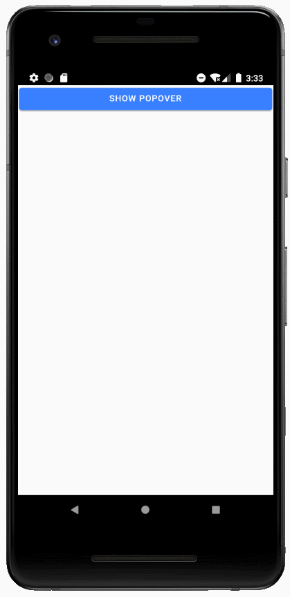
21、弹出窗口
弹出窗口(ion-popover)出现在当前页面顶部的对话框,它可以被用来做任何事情,但通常用于导航栏中不适合溢出(overflow)的操作。
import React, { useState } from 'react';
import { IonPage, IonPopover, IonButton } from '@ionic/react';

const PopoverExample: React.FC = () => {

	const [showPopover, setShowPopover] = useState(false);

	return (
		<IonPage>
			<IonPopover
				isOpen={showPopover}
				cssClass='my-custom-class'
				onDidDismiss={e => setShowPopover(false)}
			>
				<p>This is popover content</p>
			</IonPopover>
			<IonButton onClick={() => setShowPopover(true)}>Show Popover</IonButton>
		</IonPage>
	);
};

export default PopoverExample;
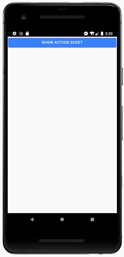
22、操作列表
ion-action-sheet是一个显示一组选项的对话框,它出现在应用程序的内容之上,必须由用户手动操作使它消失,然后才能恢复与应用程序的交互。有多种方法可以使操作列表消失,包括点击背景或按设备上的escape键。
import React, { useState } from 'react';
import { IonPage, IonActionSheet, IonContent, IonButton } from '@ionic/react';
import { trash, share, caretForwardCircle, heart, close } from 'ionicons/icons';

const ActionSheetExample: React.FC = () => {

	const [showActionSheet, setShowActionSheet] = useState(false);

	return (
		<IonPage>
			<IonContent>
				<IonButton onClick={() => setShowActionSheet(true)} expand="block">
					Show Action Sheet
				</IonButton>
				<IonActionSheet
					isOpen={showActionSheet}
					onDidDismiss={() => setShowActionSheet(false)}
					cssClass='my-custom-class'
					buttons={[{
						text: 'Delete',
						role: 'destructive',
						icon: trash,
						handler: () => {
							console.log('Delete clicked');
						}
					}, {
						text: 'Share',
						icon: share,
						handler: () => {
							console.log('Share clicked');
						}
					}, {
						text: 'Play (open modal)',
						icon: caretForwardCircle,
						handler: () => {
							console.log('Play clicked');
						}
					}, {
						text: 'Favorite',
						icon: heart,
						handler: () => {
							console.log('Favorite clicked');
						}
					}, {
						text: 'Cancel',
						icon: close,
						role: 'cancel',
						handler: () => {
							console.log('Cancel clicked');
						}
					}]}
				>
				</IonActionSheet>
			</IonContent>
		</IonPage>
	);
};

export default ActionSheetExample;
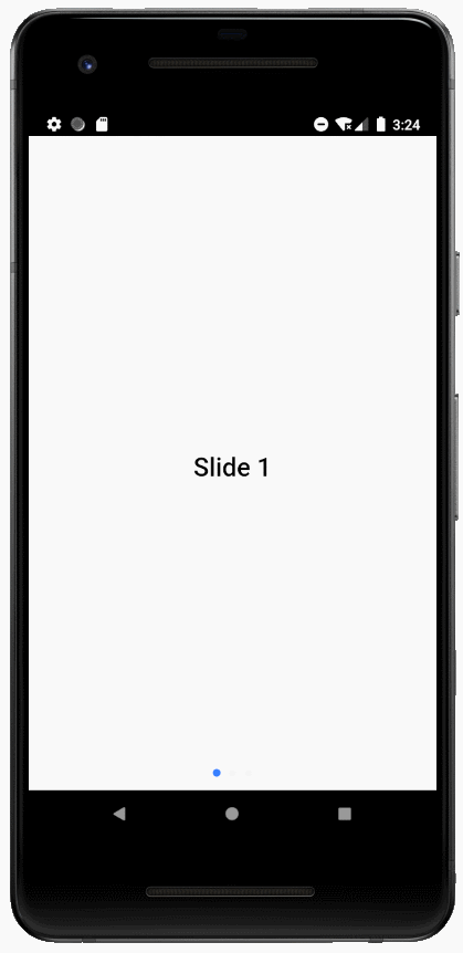
23、ion-slides
Slides(幻灯片)组件是一个多部分容器,每个部分之间可以滑动或拖动,它包含任意数量的Slide组件。
默认情况下,Ionic幻灯片组件使用内置幻灯片动画效果,也可以通过options属性设置自定义动画。
import React from 'react';
import { IonPage, IonSlides, IonSlide, IonContent } from '@ionic/react';

// Optional parameters to pass to the swiper instance.
// See http://idangero.us/swiper/api/ for valid options.
const slideOpts = {
	initialSlide: 1,
	speed: 400
};

const SlidesExample: React.FC = () => {

	const style = {height: '100%'};

	return (
		<IonPage>
			<IonContent>
				<IonSlides pager={true} options={slideOpts} style={style}>
					<IonSlide>
						<h1>Slide 1</h1>
					</IonSlide>
					<IonSlide>
						<h1>Slide 2</h1>
					</IonSlide>
					<IonSlide>
						<h1>Slide 3</h1>
					</IonSlide>
				</IonSlides>
			</IonContent>
		</IonPage>
	);
};

export default SlidesExample;
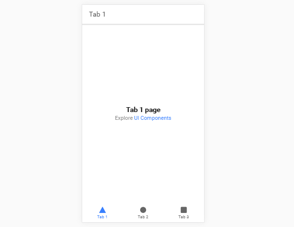
24、选项卡(Tabs)
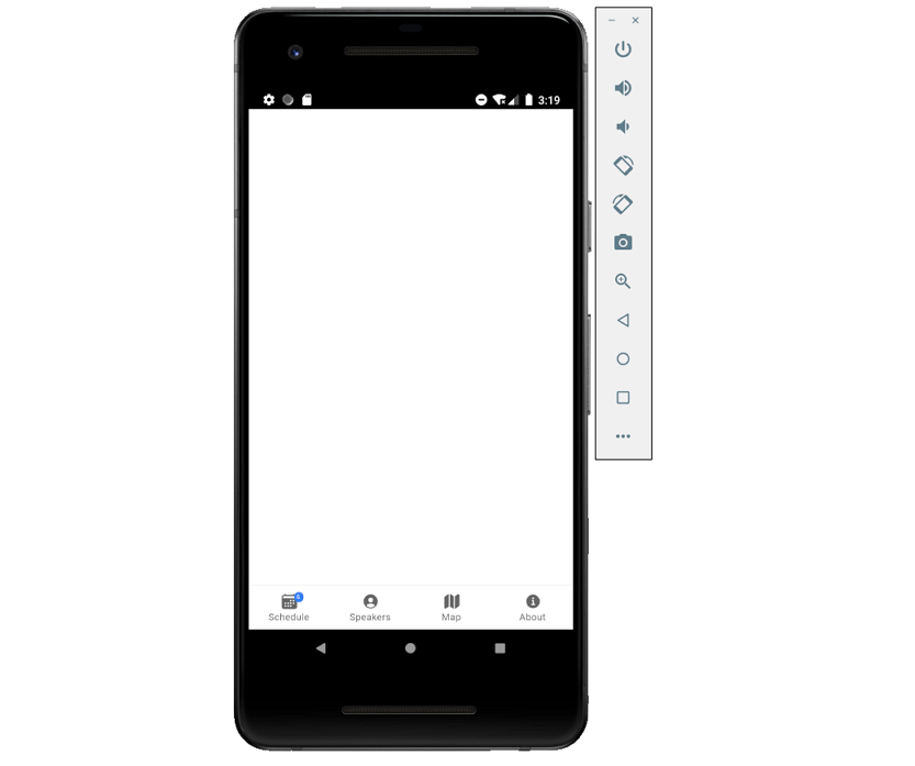
- ion-tab-button
选项卡按钮是放置在选项卡内部的UI组件,它可以指定其内部图标和标签的布局。
<IonTabButton tab="schedule">
	<IonIcon icon={calendar} />
	<IonLabel>Schedule</IonLabel>
</IonTabButton>

<IonTabButton tab="speakers">
	<IonIcon icon={personCircle} />
	<IonLabel>Speakers</IonLabel>
</IonTabButton>
- ion-tab-bar
标签栏(ion-tab-bar)是一个可以包含一组标签按钮(tab-button)的UI组件。标签栏必须提供内部的标签与每个标签通信。
<IonTabBar slot="bottom">
	<IonTabButton tab="account">
		<IonIcon icon={person} />
	</IonTabButton>
	<IonTabButton tab="contact">
		<IonIcon icon={call} />
	</IonTabButton>
</IonTabBar>
- ion-tab
此组件是ion-tabs的子组件,每个标签可以包含一个应用程序或单个视图的顶级导航堆栈。
一个应用程序可以有多个选项卡,所有的选项卡都有自己独立的导航。
- ion-tabs
ion-tabs组件是基于选项卡的顶级导航组件,该组件是单个Tab组件的容器。
import React from 'react';
import { IonPage, IonTabs, IonTabBar, IonTabButton, IonIcon, IonLabel, IonBadge, IonRouterOutlet } from '@ionic/react';
import { calendar, personCircle, map, informationCircle } from 'ionicons/icons';

const TabsExample: React.FC = () => {

	return (
		<IonPage>
			<IonTabs>
				<IonTabBar slot="bottom">
					<IonTabButton tab="schedule">
						<IonIcon icon={calendar} />
						<IonLabel>Schedule</IonLabel>
						<IonBadge>6</IonBadge>
					</IonTabButton>

					<IonTabButton tab="speakers">
						<IonIcon icon={personCircle} />
						<IonLabel>Speakers</IonLabel>
					</IonTabButton>

					<IonTabButton tab="map">
						<IonIcon icon={map} />
						<IonLabel>Map</IonLabel>
					</IonTabButton>

					<IonTabButton tab="about">
						<IonIcon icon={informationCircle} />
						<IonLabel>About</IonLabel>
					</IonTabButton>
				</IonTabBar>
				<IonRouterOutlet></IonRouterOutlet>
			</IonTabs>
		</IonPage>
	);
};

export default TabsExample;
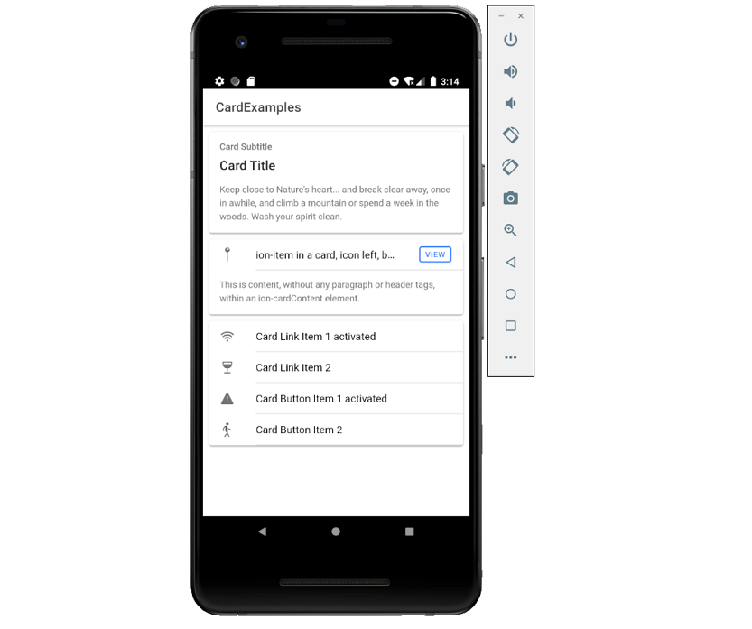
25、卡片
卡片(ion-card)是用户界面的一个标准部分,用作获取更详细信息的入口点。卡片可以是单个组件,但通常由一些ion-card-header、ion-card-title、ion-card-subtitle和ion-card-content组成。
- ion-card-header
ion-card-header是ion-card的头部组件。
- ion-card-content
卡片内容是卡片的子组件,它增加了一些内容填充;一般建议将卡片的任何文本内容都放在卡片内容中。
- ion-card-subtitle
ion-card-subtitle是ion-card的子组件。
- ion-card-title
ion-card-title是ion-card的子组件。
- ion-card
import React from 'react';
import { IonContent, IonHeader, IonPage, IonTitle, IonToolbar, IonCard, IonCardHeader, IonCardSubtitle, IonCardTitle, IonCardContent, IonItem, IonIcon, IonLabel, IonButton } from '@ionic/react';
import { pin, wifi, wine, warning, walk } from 'ionicons/icons';

const CardExample: React.FC = () => {

	return (
		<IonPage>
			<IonHeader>
				<IonToolbar>
					<IonTitle>CardExamples</IonTitle>
				</IonToolbar>
			</IonHeader>

			<IonContent>
				<IonCard>
					<IonCardHeader>
						<IonCardSubtitle>Card Subtitle</IonCardSubtitle>
						<IonCardTitle>Card Title</IonCardTitle>
					</IonCardHeader>

					<IonCardContent>
						Keep close to Nature's heart... and break clear away, once in awhile,
						and climb a mountain or spend a week in the woods. Wash your spirit clean.
					</IonCardContent>
				</IonCard>

				<IonCard>
					<IonItem>
						<IonIcon icon={pin} slot="start" />
						<IonLabel>ion-item in a card, icon left, button right</IonLabel>
						<IonButton fill="outline" slot="end">View</IonButton>
					</IonItem>

					<IonCardContent>
						This is content, without any paragraph or header tags,
						within an ion-cardContent element.
					</IonCardContent>
				</IonCard>

				<IonCard>
					<IonItem href="#" className="ion-activated">
						<IonIcon icon={wifi} slot="start" />
						<IonLabel>Card Link Item 1 activated</IonLabel>
					</IonItem>

					<IonItem href="#">
						<IonIcon icon={wine} slot="start" />
						<IonLabel>Card Link Item 2</IonLabel>
					</IonItem>

					<IonItem className="ion-activated">
						<IonIcon icon={warning} slot="start" />
						<IonLabel>Card Button Item 1 activated</IonLabel>
					</IonItem>

					<IonItem>
						<IonIcon icon={walk} slot="start" />
						<IonLabel>Card Button Item 2</IonLabel>
					</IonItem>
				</IonCard>
			</IonContent>
		</IonPage>
	);
};

export default CardExample;
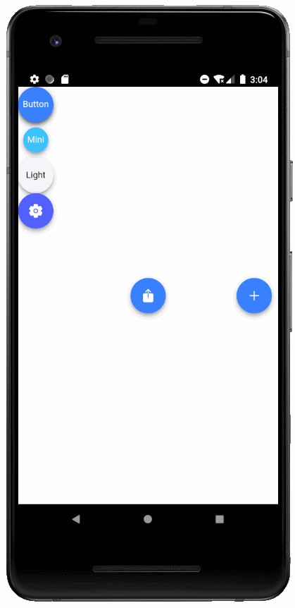
26、ion-fab
Fabs是包含一个或多个Fab按钮的容器元素,它们应该被放置在一个固定的位置,不能随着内容滚动。
Fab应该有一个主的fab-button,它也可以包含带有相关按钮的fab-list,当主的fab按钮被单击时会显示出来。同一个fab容器可以包含几个side属性不同的fab-list元素。
- ion-fab-button
浮动操作按钮(FABs)表示应用程序中的主要操作,默认情况下它们是圆形的;按下按钮后,可能会打开更多的相关操作;这不仅仅是通过<ion-fab-button>FAB</ion-fab-button>来实现的,它们需要<ion-fab>组件包裹起来,以便固定在内容上。
<IonContent>
	/*-- Fixed Floating Action Button that does not scroll with the content --*/
	<IonFab slot="fixed">
	  <IonFabButton>Button</IonFabButton>
	</IonFab>

	/*-- Default Floating Action Button that scrolls with the content.--*/
	<IonFabButton>Default</IonFabButton>

	/*-- Mini --*/
	<IonFabButton size="small">Mini</IonFabButton>

	/*-- Colors --*/
	<IonFabButton color="primary">Primary</IonFabButton>
	<IonFabButton color="light">Light</IonFabButton>
</IonContent>
- ion-fab-list
ion-fab-list元素是多个fab按钮的容器,这组fab按钮包含与主fab按钮相关的操作,通过点击就可以显示出来。可以通过side属性指定按钮应该出现在哪一侧(start、end、top、bottom)。
<IonFabList side="top">
	<IonFabButton>
		<IonIcon icon={logoFacebook} />
	</IonFabButton>
	<IonFabButton>
		<IonIcon icon={logoTwitter} />
	</IonFabButton>
	<IonFabButton>
		<IonIcon icon={logoYoutube} />
	</IonFabButton>
</IonFabList>
- ion-fab
import React from 'react';
import { IonContent, IonPage, IonFab, IonFabButton, IonIcon, IonFabList } from '@ionic/react';
import { add, settings, logoVimeo, share, logoFacebook, logoInstagram, logoTwitter } from 'ionicons/icons';

const FabExample: React.FC = () => {

	return (
		<IonPage>
			<IonContent>
				{/*-- Fixed Floating Action Button that does not scroll with the content --*/}
				<IonFab slot="fixed">
				  <IonFabButton>Button</IonFabButton>
				</IonFab>

				{/*-- Default Floating Action Button that scrolls with the content.--*/}
				<IonFabButton>Default</IonFabButton>

				{/*-- Mini --*/}
				<IonFabButton size="small" color="secondary">Mini</IonFabButton>

				{/*-- fab placed to the (vertical) center and end --*/}
				<IonFab vertical="center" horizontal="end" slot="fixed">
					<IonFabButton>
						<IonIcon icon={add} />
					</IonFabButton>
				</IonFab>

				{/*-- Colors --*/}
				<IonFabButton color="light">Light</IonFabButton>

				<IonFabButton color="tertiary"><IonIcon icon={settings} /></IonFabButton>

				{/*-- fab placed in the center of the content with a list on each side --*/}
				<IonFab vertical="center" horizontal="center" slot="fixed">
					<IonFabButton>
						<IonIcon icon={share} />
					</IonFabButton>
					<IonFabList side="top">
						<IonFabButton><IonIcon icon={logoVimeo} /></IonFabButton>
					</IonFabList>
					<IonFabList side="bottom">
						<IonFabButton><IonIcon icon={logoFacebook} /></IonFabButton>
					</IonFabList>
					<IonFabList side="start">
						<IonFabButton><IonIcon icon={logoInstagram} /></IonFabButton>
					</IonFabList>
					<IonFabList side="end">
						<IonFabButton><IonIcon icon={logoTwitter} /></IonFabButton>
					</IonFabList>
				</IonFab>
			</IonContent>
		</IonPage>
	);
};

export default FabExample;
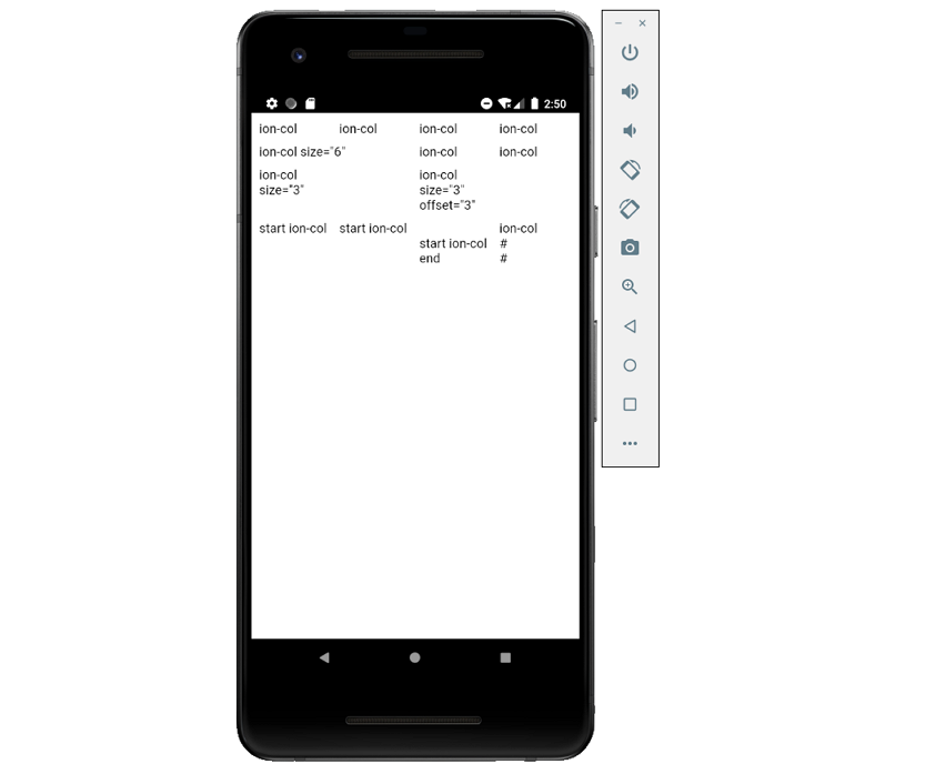
27、表格
表格(ion-gird)是一个用来建立自定义布局的移动端优先的flexbox系统;它由三个单元组成: 网格、行和列,列将展开以填充行,并将调整大小以适应其他列。它基于12列布局,根据屏幕大小具有不同的断点,可以使用CSS来自定义列的数量。
- ion-row
行是网格系统的水平组件,是Flex容器,它包含不同数量的列。
- ion-col
列位于行的内部,它们将扩大以填补所在的行;一个网格中的所有内容都应该放在一个列中。
默认情况下,列将拉伸以填充行的整个高度,并在必要时进行换行。
- ion-gird
import React from 'react';
import { IonPage, IonGrid, IonRow, IonCol, IonContent } from '@ionic/react';

const GridExample: React.FC = () => {

	return (
		<IonPage>
			<IonContent>
				 <IonGrid>
					<IonRow>
						<IonCol>ion-col</IonCol>
						<IonCol>ion-col</IonCol>
						<IonCol>ion-col</IonCol>
						<IonCol>ion-col</IonCol>
					</IonRow>

					<IonRow>
						<IonCol size="6">ion-col size="6"</IonCol>
						<IonCol>ion-col</IonCol>
						<IonCol>ion-col</IonCol>
					</IonRow>

					<IonRow>
						<IonCol size="3">ion-col size="3"</IonCol>
						<IonCol size="3" offset="3">
						ion-col size="3" offset="3"
						</IonCol>
					</IonRow>

					<IonRow className="ion-align-items-start">
						<IonCol>start ion-col</IonCol>
						<IonCol>start ion-col</IonCol>
						<IonCol className="ion-align-self-end">start ion-col end</IonCol>
						<IonCol>
							ion-col
							<br />#
							<br />#
						</IonCol>
					</IonRow>
				</IonGrid>
			</IonContent>
		</IonPage>
	);
};

export default GridExample;
28、媒体(Media)
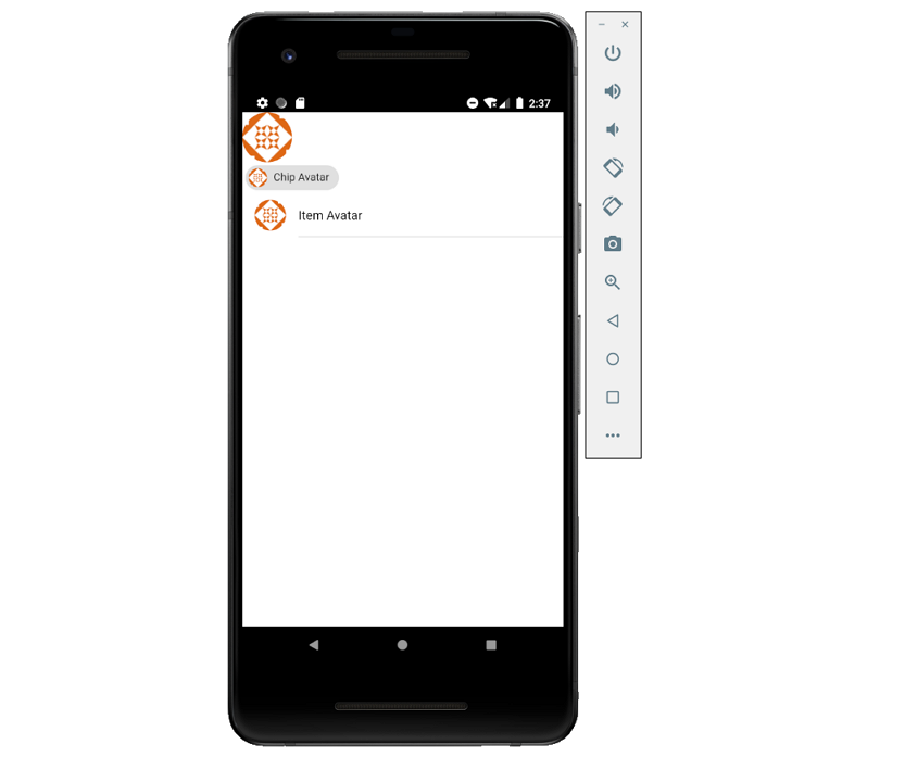
- ion-avatar
Avatar是一个包装了图像或图标的圆形组件,可以用来代表一个人或一个对象。
Avatars可以单独使用也可以在任何元素中使用,如果放在ion-chip或ion-item中,Avatar将调整大小,以适应父组件。可以通过设置slot(插槽)属性为start或end将Avatar定位在项目(Item)的左侧或右侧。
import React from 'react';
import { IonPage, IonAvatar, IonChip, IonItem, IonLabel, IonContent } from '@ionic/react';

const AvatarExample: React.FC = () => {

	return (
		<IonPage>
			<IonContent>
				<IonAvatar>
					<img src="https://gravatar.com/avatar/dba6bae8c566f9d4041fb9cd9ada7741?d=identicon&f=y" />
				</IonAvatar>

				<IonChip>
					<IonAvatar>
						<img src="https://gravatar.com/avatar/dba6bae8c566f9d4041fb9cd9ada7741?d=identicon&f=y" />
					</IonAvatar>
					<IonLabel>Chip Avatar</IonLabel>
				</IonChip>

				<IonItem>
					<IonAvatar slot="start">
						<img src="https://gravatar.com/avatar/dba6bae8c566f9d4041fb9cd9ada7741?d=identicon&f=y" />
					</IonAvatar>
					<IonLabel>Item Avatar</IonLabel>
				</IonItem>
			</IonContent>
		</IonPage>
	);
};

export default AvatarExample;
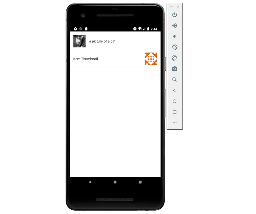
- ion-thumbnail
缩略图是一个通常包装图像或图标的正方形组件,它们可以用来更容易地显示一组较大的图像或提供全尺寸图像的预览。
缩略图可以单独使用也可以在任何元素中使用,如果放在ion-chip或ion-item中,缩略图将调整大小,以适应父组件。可以通过设置slot(插槽)属性为start或end将缩略图定位在项目(Item)的左侧或右侧。
import React from 'react';
import { IonThumbnail, IonItem, IonLabel, IonContent } from '@ionic/react';

export const ThumbnailExample: React.FC = () => (
	<IonContent>
		<IonThumbnail>
			<img src="https://gravatar.com/avatar/dba6bae8c566f9d4041fb9cd9ada7741?d=identicon&f=y" />
		</IonThumbnail>

		<IonItem>
			<IonThumbnail slot="start">
				<img src="https://gravatar.com/avatar/dba6bae8c566f9d4041fb9cd9ada7741?d=identicon&f=y" />
			</IonThumbnail>
			<IonLabel>Item Thumbnail</IonLabel>
		</IonItem>
	</IonContent>
);
- ion-img
当Img标记出现在视口中时,会懒加载图像,这在生成大型列表时非常有用,因为图像只有在可见时才会加载。该组件在内部使用Intersection Observer,这在大多数现代浏览器中都支持,如果不支持时会使用setTimeout。
import React from 'react';
import { IonPage, IonList, IonItem, IonThumbnail, IonImg, IonLabel, IonContent } from '@ionic/react';

type Item = {
	src: string;
	text: string;
};
const items: Item[] = [{ src: 'http://placekitten.com/g/200/300', text: 'a picture of a cat' }];

const ImgExample: React.FC = () => {

	return (
		<IonPage>
			<IonContent>
				<IonList>
					{items.map((image, i) => (
						<IonItem key={i}>
							<IonThumbnail slot="start">
								<IonImg src={image.src} />
							</IonThumbnail>
							<IonLabel>{image.text}</IonLabel>
						</IonItem>
					))}
				</IonList>

				<IonItem>
					<IonThumbnail slot="end">
						<img src="https://gravatar.com/avatar/dba6bae8c566f9d4041fb9cd9ada7741?d=identicon&f=y" />
					</IonThumbnail>
					<IonLabel>Item Thumbnail</IonLabel>
				</IonItem>
			</IonContent>
		</IonPage>
	);
};

export default ImgExample;
29、分割窗格
分割窗格(ion-split-pane)在创建多视图布局时非常有用,它允许UI元素(例如菜单)可以随着视口宽度的增加而显示。如果设备的屏幕宽度小于指定的大小,分割窗格将折叠,菜单将被隐藏。
默认情况下,当屏幕大于992px时分割窗格将会展开;可以使用when属性设置自定义分割点,此属性可以接受布尔值、任何有效的媒体查询或Ionic内置的的大小值。
import React from 'react';
import { IonSplitPane, IonMenu, IonHeader, IonToolbar, IonTitle, IonRouterOutlet, IonContent, IonPage} from '@ionic/react';

const SplitPlaneExample: React.SFC = () => {

	return (
		<IonPage>
			<IonContent>
				<IonSplitPane contentId="main">
					{/*--  the side menu  --*/}
					<IonMenu contentId="main">
						<IonHeader>
							<IonToolbar>
								<IonTitle>Menu</IonTitle>
							</IonToolbar>
						</IonHeader>
					</IonMenu>

					{/*-- the main content --*/}
					<IonPage id="main">
						<h1>Hello World!</h1>
					</IonPage>
				</IonSplitPane>
			</IonContent>
		</IonPage>
	);
};

export default SplitPlaneExample;
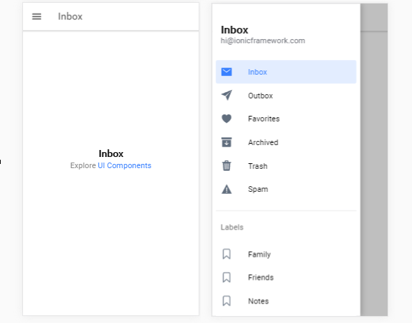
30、菜单
Menu组件是从当前视图侧滑入的导航抽屉,默认情况下从左侧滑入,可以重新设置滑入方向。
Menu元素应该是根content元素的同级元素,可以有任意数量的菜单附加到content。
- ion-menu-button
菜单按钮是用于打开页面上菜单的自动创建的图标和功能组件。
- ion-menu-toggle
MenuToggle组件可用于切换打开或关闭的菜单,默认情况下只有当选择的菜单处于活动状态时,它才可见。当菜单可以打开或关闭时,它是活动的;如果菜单被禁用或者被显示为分割窗格,则菜单被标记为非活动,ion-menu-toggle隐藏其自身。如果希望始终保持ion-menu-toggle可见,可以设置autoHide属性为false。
- ion-menu
import React from 'react';
import { IonPage, IonMenu, IonHeader, IonToolbar, IonTitle, IonContent, IonList, IonItem, IonMenuButton, IonButton } from '@ionic/react';

const MenuExample: React.FC = () => (
	<IonPage>
		<IonMenu side="start" menuId="first" content-id="main-content">
			<IonHeader>
				<IonToolbar color="primary">
				<IonTitle>Start Menu</IonTitle>
				</IonToolbar>
			</IonHeader>
			<IonContent>
				<IonList>
					<IonItem>Menu Item A</IonItem>
					<IonItem>Menu Item B</IonItem>
					<IonItem>Menu Item C</IonItem>
				</IonList>
			</IonContent>
		</IonMenu>
		<IonMenu side="end" type="push" content-id="main-content">
			<IonHeader>
				<IonToolbar color="danger">
					<IonTitle>End Menu</IonTitle>
				</IonToolbar>
			</IonHeader>
			<IonContent>
				<IonList>
					<IonItem>Menu Item 1</IonItem>
					<IonItem>Menu Item 2</IonItem>
					<IonItem>Menu Item 3</IonItem>
				</IonList>
			</IonContent>
		</IonMenu>
		{/*-- the main content --*/}
		<IonPage id="main-content">
			<IonHeader>
				<IonToolbar color="secondary">
					<IonTitle>Menu</IonTitle>
				</IonToolbar>
			</IonHeader>
		</IonPage>
	</IonPage>
);

export default MenuExample;
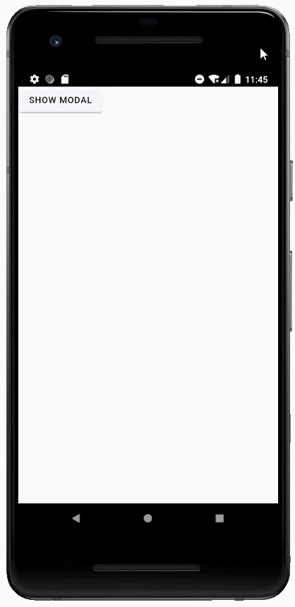
31、模态
- ion-modal
模态对话框出现在应用程序的内容之上,必须被应用程序取消(dismiss)后才能继续交互。
import React, { useState } from 'react';
import { IonPage, IonModal, IonButton, IonContent } from '@ionic/react';

const ModalExample: React.FC = () => {

	const [showModal, setShowModal] = useState(false);

	return (
		<IonPage>
			<IonContent>
				<IonModal isOpen={showModal} cssClass='my-custom-class'>
					<p>This is modal content</p>
					<IonButton onClick={() => setShowModal(false)} color='light'>Close Modal</IonButton>
				</IonModal>
				<IonButton onClick={() => setShowModal(true)} color='light'>Show Modal</IonButton>
			</IonContent>
		</IonPage>
	);
};

export default ModalExample;
- ion-backdrop
Backdrops(背景)是覆盖其他组件的全屏组件。
import React from 'react';
import { IonBackdrop, IonContent } from '@ionic/react';

<IonContent>
	{/*-- Default backdrop --*/}
	<IonBackdrop />

	{/*-- Backdrop that is not tappable --*/}
	<IonBackdrop tappable={false} />

	{/*-- Backdrop that is not visible --*/}
	<IonBackdrop visible={false} />

	{/*-- Backdrop with propagation --*/}
	<IonBackdrop stopPropagation={false} />

	<IonBackdrop tappable={true} visible={true} stopPropagation={true} />
</IonContent>
32、导航
- ion-nav
Nav是一个独立组件,用于加载任意组件并将新组件添加到栈中。
- ion-nav-link
导航链接可以用来定位到指定的组件,可以通过前进(forward)、后退(back)或作为根组件(root)导航到该组件。
33、进度指示器(Progress Indicators)
- ion-loading
加载指示器是一个覆盖层,可以用来指示活动,同时阻止用户交互。它出现在应用程序的内容之上,并且可以被应用程序忽略以恢复用户与应用程序的交互。它在创建时可以通过showBackdrop: false来禁用背景。
import React, { useState } from 'react';
import { IonPage, IonLoading, IonButton, IonContent } from '@ionic/react';

const LoadingExample: React.FC = () => {

	const [showLoading, setShowLoading] = useState(true);

	setTimeout(() => {
		setShowLoading(false);
	}, 1500);

	return (
		<IonPage>
			<IonContent>
				<IonButton onClick={() => setShowLoading(true)}>Show Loading</IonButton>
				<IonLoading
					isOpen={showLoading}
					onDidDismiss={() => setShowLoading(false)}
					message={'Please wait...'}
					duration={5000}
				/>
			</IonContent>
		</IonPage>
	);
};

export default LoadingExample;
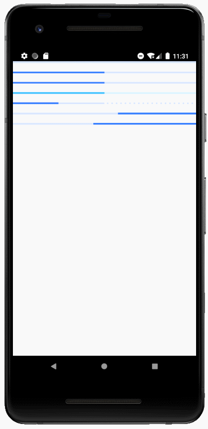
- ion-progress-bar
ion-progress-bar是一个水平的进度条,用来显示一个操作和活动的进度(progression),有两种类型可以选择:确定型(determinate)和不确定型(indeterminate)。
确定型:如果已知某个操作的百分比,则应使用确定类型。默认为该类型,进度由value属性表示。
不确定型:如果一个操作正在进行,不需要指出需要多长时间,可以使用此类型。
import React from 'react';
import { IonPage, IonContent, IonProgressBar } from '@ionic/react';

const ProgressbarExample: React.FC = () => {

	return (
		<IonPage>
			<IonContent>
				{/*-- Default Progressbar --*/}
				<IonProgressBar></IonProgressBar><br />

				{/*-- Default Progressbar with 50 percent --*/}
				<IonProgressBar value={0.5}></IonProgressBar><br />

				{/*-- Colorize Progressbar --*/}
				<IonProgressBar color="primary" value={0.5}></IonProgressBar><br />
				<IonProgressBar color="secondary" value={0.5}></IonProgressBar><br />

				{/*-- Other types --*/}
				<IonProgressBar value={0.25} buffer={0.5}></IonProgressBar><br />
				<IonProgressBar type="indeterminate"></IonProgressBar><br />
				<IonProgressBar type="indeterminate" reversed={true}></IonProgressBar><br />
			</IonContent>
		</IonPage>
	);
};

export default ProgressbarExample;
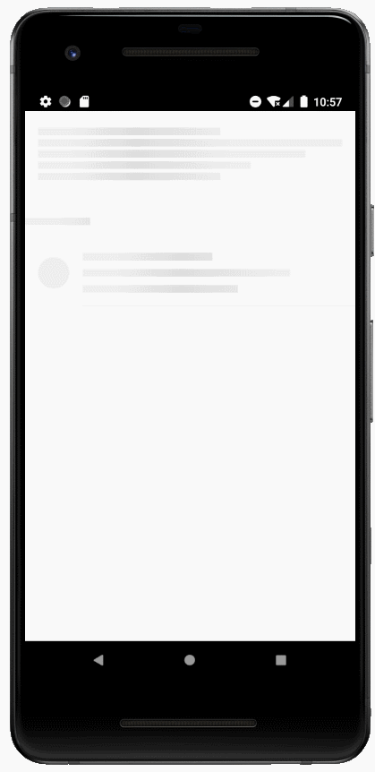
- ion-skeleton-text
骨架文本(Skeleton Text)是呈现占位符内容的组件,该元素将呈现指定宽度的灰色块。
import React, { useState } from 'react';
import { IonPage, IonContent, IonItem, IonAvatar, IonLabel, IonSkeletonText, IonListHeader, IonIcon, IonThumbnail, IonList } from '@ionic/react';
import { call } from 'ionicons/icons';

const SkeletonTextExample: React.FC = () => {

	const [data, setData] = useState({
		heading: '',
		para1: '',
		para2: ''
	});

	const [flag, setFlag] = useState(false);

	setTimeout(() => {
	    setData(prevState => ({
            ...prevState,
            heading: 'Normal text',
			para1: 'Lorem ipsum dolor sit amet, consectetur',
			para2: 'adipiscing elit.'
        }));
        setFlag(true);
  	}, 1000);

	return (
		<IonPage>
			<IonContent>
				{flag ?
					(<>
						<div className="ion-padding">
							Lorem ipsum dolor sit amet, consectetur adipiscing elit. Nulla ac eros est. Cras iaculis pulvinar
							arcu non vehicula. Fusce at quam a eros malesuada condimentum. Aliquam tincidunt tincidunt
							vehicula.
						</div>

						<IonList>
							<IonListHeader>
								<IonLabel>Data</IonLabel>
							</IonListHeader>
							<IonItem>
								<IonAvatar slot="start">
									<img src="https://gravatar.com/avatar/dba6bae8c566f9d4041fb9cd9ada7741?d=identicon&f=y" />
								</IonAvatar>
								<IonLabel>
									<h3>{data.heading}</h3>
									<p>{data.para1}</p>
									<p>{data.para2}</p>
								</IonLabel>
							</IonItem>
						</IonList>
					</>) :
					(<>
						<div className="ion-padding custom-skeleton">
							<IonSkeletonText animated style={ { width: '60%' } } />
							<IonSkeletonText animated />
							<IonSkeletonText animated style={ { width: '88%' } } />
							<IonSkeletonText animated style={ { width: '70%' } } />
							<IonSkeletonText animated style={ { width: '60%' } } />
						</div>

						<IonList>
							<IonListHeader>
								<IonLabel>
									<IonSkeletonText animated style={ { width: '20%' } } />
								</IonLabel>
							</IonListHeader>
							<IonItem>
								<IonAvatar slot="start">
									<IonSkeletonText animated />
								</IonAvatar>
								<IonLabel>
									<h3><IonSkeletonText animated style={ { width: '50%' } } /></h3>
									<p><IonSkeletonText animated style={ { width: '80%' } } /></p>
									<p><IonSkeletonText animated style={ { width: '60%' } } /></p>
								</IonLabel>
							</IonItem>
						</IonList>
					</>)
				}
			</IonContent>
		</IonPage>
	);
};

export default SkeletonTextExample;
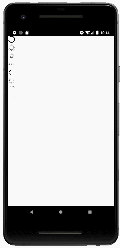
- ion-spinner
Spinner组件提供了各种动画的SVG旋转器,旋转器是应用程序正在加载内容或执行用户需要等待的另一个进程的可视化指示器。Ios的默认旋转器是lines,Android的默认旋转器是crescent,可以通过name属性设置指定的旋转器。
import React from 'react';
import { IonPage, IonSpinner, IonContent } from '@ionic/react';

const SpinnerExample: React.FC = () => (
	<IonPage>
		<IonContent>
			{/*-- Default Spinner --*/}
		    <IonSpinner /><br/>

		    {/*-- Lines --*/}
		    <IonSpinner name="lines" /><br/>

		    {/*-- Lines Small --*/}
		    <IonSpinner name="lines-small" /><br/>

		    {/*-- Dots --*/}
		    <IonSpinner name="dots" /><br/>

		    {/*-- Bubbles --*/}
		    <IonSpinner name="bubbles" /><br/>

		    {/*-- Circles --*/}
		    <IonSpinner name="circles" /><br/>

		    {/*-- Crescent --*/}
		    <IonSpinner name="crescent" /><br/>

		    {/*-- Paused Default Spinner --*/}
		    <IonSpinner paused />
		</IonContent>
	</IonPage>
);

export default SpinnerExample;
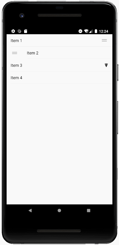
34、重排序(Reorder)
- ion-reorder
Reorder是可以允许拖动一组项目中的某个项目以更改其在该组中顺序的组件,它必须在ion-reorder-group中使用,以提供一个可视化的拖放界面。
- ion-reorder-group
此组件是包装重新排序组件(ion-reorder)的组件,一旦用户拖动一个项目并将其放置到新的位置时,ionItemReorder事件会被触发,在处理程序完成时需要调用event.detail的complete()方法。
import React from 'react';
import { IonPage, IonItem, IonLabel, IonReorder, IonReorderGroup, IonIcon, IonContent } from '@ionic/react';
import { ItemReorderEventDetail } from '@ionic/core';
import { pizza } from 'ionicons/icons';

function doReorder(event: CustomEvent<ItemReorderEventDetail>) {
	// The `from` and `to` properties contain the index of the item
	// when the drag started and ended, respectively
	console.log('Dragged from index', event.detail.from, 'to', event.detail.to);

	// Finish the reorder and position the item in the DOM based on
	// where the gesture ended. This method can also be called directly
	// by the reorder group
	event.detail.complete();
}

const ReorderExample: React.FC = () => (
	<IonPage>
		<IonContent>
			{/*-- The reorder gesture is disabled by default, enable it to drag and drop items --*/}
			<IonReorderGroup disabled={false} onIonItemReorder={doReorder}>
			{/*-- Default reorder icon, end aligned items --*/}
				<IonItem>
					<IonLabel>Item 1</IonLabel>
					<IonReorder slot="end" />
				</IonItem>

			{/*-- Default reorder icon, start aligned items --*/}
			<IonItem>
				<IonReorder slot="start" />
				<IonLabel>Item 2</IonLabel>
			</IonItem>

			{/*-- Custom reorder icon end items --*/}
			<IonItem>
				<IonLabel>Item 3</IonLabel>
				<IonReorder slot="end">
					<IonIcon icon={pizza} />
				</IonReorder>
			</IonItem>

			{/*-- Items wrapped in a reorder, entire item can be dragged --*/}
			<IonReorder>
				<IonItem>
					<IonLabel>Item 4</IonLabel>
				</IonItem>
			</IonReorder>
			</IonReorderGroup>
		</IonContent>
	</IonPage>
);

export default ReorderExample;
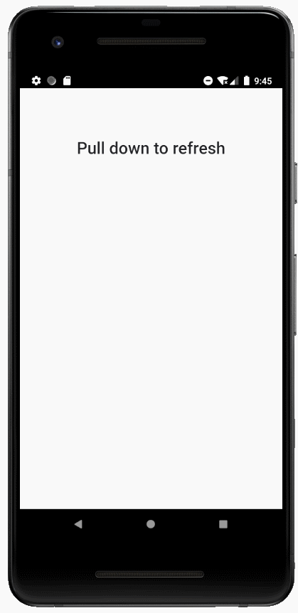
35、ion-refresher
刷新器(refresher)为内容组件提供了拉动刷新功能,拉动刷新模式允许用户使用触摸在数据列表上下拉以获取更多的数据。
拉动刷新会触发ionRefresh事件,在处理程序完成时需要调用event.detail的complete()方法。
import React from 'react';
import { IonPage, IonContent, IonRefresher, IonRefresherContent, IonText } from '@ionic/react';
import { RefresherEventDetail } from '@ionic/core';

function doRefresh(event: CustomEvent<RefresherEventDetail>) {
	console.log('Begin async operation');

	setTimeout(() => {
		console.log('Async operation has ended');
		event.detail.complete();
	}, 1000);
}

const RefresherExample: React.FC = () => {

	const style = {textAlign: 'center', marginTop: '80px'};

	return (
		<IonPage>
			<IonContent>
				{/*-- Custom Refresher Properties --*/}
				<IonRefresher slot="fixed" onIonRefresh={doRefresh} pullFactor={0.5} pullMin={100} pullMax={200}>
					<IonRefresherContent></IonRefresherContent>
				</IonRefresher>
				<IonText color="dark"><h1 style={style}>Pull down to refresh</h1></IonText>
			</IonContent>
		</IonPage>
	);
};

export default RefresherExample;