Flexbox布局案例
一、手风琴
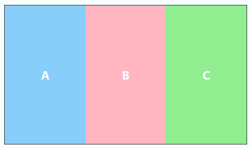
- HTML
<div class="flex">
	<div>A</div>
	<div>B</div>
	<div>C</div>
</div>
- CSS
.flex{
	display: flex;
	width: 350px;
	height: 200px;
	border: 1px solid #555;
	color: #FFF;
	font-weight: bold;
}
.flex > div{
	width: 30px;
	flex: 1 1 auto;
	display: flex;
	align-items: center;
	justify-content: center;
	transition: width 0.7s ease-out;
}
.flex > div:hover{
	width: 200px;
}
.flex > div:nth-child(1){
	background-color: lightskyblue;
}
.flex > div:nth-child(2){
	background-color: lightpink;
}
.flex > div:nth-child(3){
	background-color: lightgreen;
}
二、圣杯
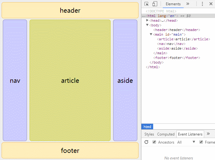
- HTML
<header>header</header>
<main id="main">
	<article>article</article>
	<nav>nav</nav>
	<aside>aside</aside>
</main>
<footer>footer</footer>
- CSS
body{
	font-size: 20px;
	background-color: #EEE;
}
header, footer, #main > article, #main > nav, #main > aside{
	display: flex;
	align-items: center;
	justify-content: center;
}
header, footer{
	min-height: 100px;
	border: 1px solid #EEBB55;
	border-radius: 7px;
	background: #FFEEBB;
}
#main{
	min-height: 600px;
	margin: 0;
	padding: 0;
	display: flex;
}
#main > article{
	margin: 4px;
	border: 1px solid #CCCC33;
	border-radius: 7px;
	background-color: #DDDD88;
	flex: 3 1 60%;
	order: 2;
}
#main > nav{
	margin: 4px;
	border: 1px solid #8888BB;
	border-radius: 7px;
	background-color: #CCCCFF;
	flex: 1 6 20%;
	order: 1;
}
#main > aside{
	margin: 4px;
	border: 1px solid #8888BB;
	border-radius: 7px;
	background-color: #CCCCFF;
	flex: 1 6 20%;
	order: 3;
}

@media all and (max-width: 640px) {
	#main{
		flex-direction: column;
	}
	#main > article, #main > nav, #main > aside{
		/*恢复到源文件中的顺序*/
		order: 0;
	}
	#main > nav, #main > aside, header, footer{
		min-height: 50px;
		max-height: 50px;
	}
}
三、导航
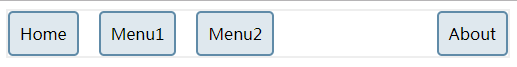
-
要点
-
将ul设置为弹性容器(
display: flex;) -
给需要显示在右侧的菜单设置
margin-left: auto; -
合理使用
margin调整间距
-
-
HTML
<nav>
	<ul>
		<li><a href="#">Home</a></li>
		<li><a href="#">Menu1</a></li>
		<li><a href="#">Menu2</a></li>
		<li class="push-right"><a href="#">About</a></li>
	</ul>
</nav>
- CSS
nav{
	border: 2px solid #eee;
	width: 500px;
}
nav ul{
	display: flex;
	margin: 0 -10px;
	list-style: none;
	padding: 0;
}
nav ul > li{
	margin: 0 10px;
}
nav ul > li > a{
	display: inline-block;
	text-decoration: none;
	color: #000;
	border: 2px solid #608ba8;
	border-radius: 5px;
	padding: 10px;
	background-color: rgba(96, 139, 168, .2);
}
.push-right{
	margin-left: auto;
}
四、居中
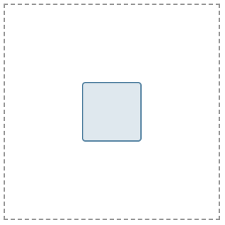
-
要点
-
display设置父元素
display为flex -
justify-content与align-items设置父元素的
justify-content和align-items属性为center; 也可以只设置父元素的justify-content为center同时设置子元素的align-self为center
-
-
HTML
<div class="flex">
	<div></div>
</div>
- CSS
.flex{
	display: flex;
	justify-content: center;
	align-items: center;
	border: 2px dashed #979797;
	width: 300px;
	height: 300px;
}
.flex div{
	width: 80px;
	height: 80px;
	border: 2px solid #608ba8;
	border-radius: 5px;
	background-color:rgba(96, 139, 168, 0.2);
}
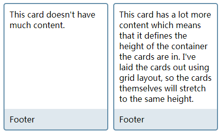
五、卡片
页脚始终保持在下方的卡片布局:
-
要点
-
将
.card设置为弹性容器 -
将弹性容器的主轴设置为column
-
设置
.card中的.content的flex-grow为1
-
-
HTML
<div class="cards">
	<div class="card">
		<div class="content">
			This card doesn't have much content.
		</div>
		<footer>Footer</footer>
	</div>
	<div class="card">
		<div class="content">
			This card has a lot more content which means that it defines the height of the container the cards are in. I've laid the cards out using grid layout, so the cards themselves will stretch to the same height.
		</div>
		<footer>Footer</footer>
	</div>
</div>
- CSS
.cards{
	display: grid;
	grid-template-columns: repeat(auto-fill,minmax(200px,1fr));
	grid-gap: 10px;
}
.card{
	border: 2px solid #608ba8;
	border-radius: 5px;
	display: flex;
	flex-direction: column;
}
.card footer{
	background-color: rgba(96, 139, 168, .2);
	padding: 10px;
}
.card .content{
	padding: 10px;
	flex-grow: 1;
}
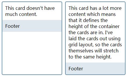
下图为.card .content未设置flex-grow: 1;时的效果
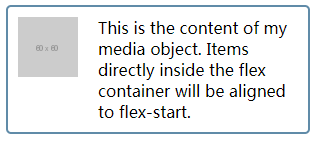
六、媒体对象
Media object是一个常见的web设计模式,此模式中的一侧包含一个图片或其他元素,另一侧为文本。理想的media object应该是可以翻转的,即可以将图片从一侧移动到另一侧。
-
要点
和卡片布局类似,只不过此处主轴为默认值(row)
-
将容器
.media设置为弹性容器 -
将文字
.content的flex-grow设置为1
-
-
HTML
<div class="media">
	<div class="image"><img src="https://placehold.it/60x60" alt="placeholder"></div>
	<div class="content">This is the content of my media object. Items directly inside the flex container will be aligned to flex-start.</div>
</div>
- CSS
.media{
	border: 2px solid #608ba8;
	border-radius: 5px;
	width: 300px;
	display: flex;
}
.content{
	flex: 1;
	padding: 10px;
}
.image{
	margin: 10px;
}
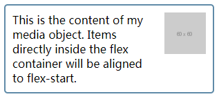
- 切换位置
给.media的div添加以下的.flipped样式即可:
.flipped{
	flex-direction: row-reverse;
}
七、表单控件
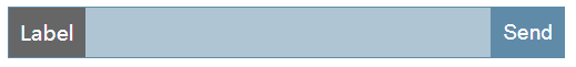
-
要点
和媒体对象类似,在这个例子中,设置
.wrapper为弹性容器,设置其中的text输入框的flex-grow为1。 -
HTML
<form>
	<div class="wrapper">
		<label for="text">Label</label>
		<input type="text" id="text">
		<input type="submit" value="Send">
	</div>
</form>
- CSS
.wrapper{
	display: flex;
	width: 500px;
	border: 1px solid rgb(96, 139, 168);
}
.wrapper *{
	border: none;
}
.wrapper label, .wrapper input{
	font-size: 1.2em;
	margin: 0;
	padding: 10px;
}
.wrapper label{
	background-color: #666;
	color: #fff;
}
.wrapper input[type="text"]{
	flex: 1;
	background-color: rgba(96, 139, 168,.5);
	border-right: 1px solid rgb(96, 139, 168);
}
.wrapper input[type="submit"]{
	background-color: rgba(96, 139, 168,1);
	color: #fff;
}