Bootstrap
一、简介
Bootstrap是Twitter推出的一个用于前端开发的开源工具包,用于构建响应式、移动设备优先的网站。
Bootstrap依赖jQuery和Popper.js,因此在使用时除了引入bootstrap的样式文件和脚本文件外,还需要引入jQuery.js和Popper.js:
CSS
<link rel="stylesheet" href="https://cdn.bootcss.com/bootstrap/4.0.0/css/bootstrap.min.css" integrity="sha384-Gn5384xqQ1aoWXA+058RXPxPg6fy4IWvTNh0E263XmFcJlSAwiGgFAW/dAiS6JXm" crossorigin="anonymous">
或引入本地CSS文件:
<link rel="stylesheet" type="text/css" href="css/bootstrap.css">
JS
<script src="https://cdn.bootcss.com/jquery/3.2.1/jquery.slim.min.js" integrity="sha384-KJ3o2DKtIkvYIK3UENzmM7KCkRr/rE9/Qpg6aAZGJwFDMVNA/GpGFF93hXpG5KkN" crossorigin="anonymous"></script>
<script src="https://cdn.bootcss.com/popper.js/1.12.9/umd/popper.min.js" integrity="sha384-ApNbgh9B+Y1QKtv3Rn7W3mgPxhU9K/ScQsAP7hUibX39j7fakFPskvXusvfa0b4Q" crossorigin="anonymous"></script>
<script src="https://cdn.bootcss.com/bootstrap/4.0.0/js/bootstrap.min.js" integrity="sha384-JZR6Spejh4U02d8jOt6vLEHfe/JQGiRRSQQxSfFWpi1MquVdAyjUar5+76PVCmYl" crossorigin="anonymous"></script>
或引入本地JS文件:
<script type="text/javascript" src="js/jquery-3.0.0.slim.js"></script>
<script type="text/javascript" src="js/popper.js"></script>
<script type="text/javascript" src="js/bootstrap.js"></script>
二、基础CSS样式
详细请参考:https://v2.bootcss.com/base-css.html
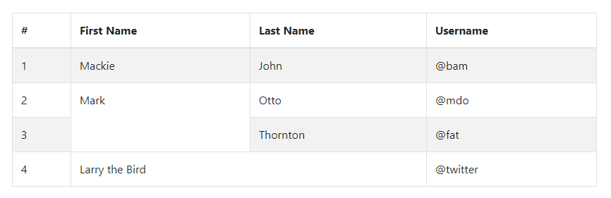
1、表格
table-striped
斑马线条纹样式
table-bordered
边框和圆角
table-hover
鼠标悬停样式
- Example
<table class="table table-striped table-bordered table-hover">
	<thead>
		<tr><th>#</th><th>First Name</th><th>Last Name</th><th>Username</th></tr>
	</thead>
	<tbody>
		<tr><td>1</td><td>Mackie</td><td>John</td><td>@bam</td></tr>
		<tr><td>2</td><td rowspan="2">Mark</td><td>Otto</td><td>@mdo</td></tr>
		<tr><td>3</td><td>Thornton</td><td>@fat</td></tr>
		<tr><td>4</td><td colspan="2">Larry the Bird</td><td>@twitter</td></tr>
	</tbody>
</table>
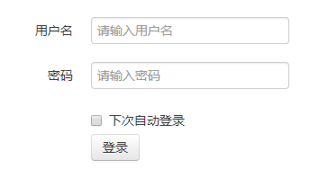
2、表单
- Example
<form class="form-horizontal">
	<div class="control-group">
		<label class="control-label" for="username">用户名</label>
		<div class="controls"><input id="username" type="text" placeholder="请输入用户名"></div>
	</div>
	<div class="control-group">
		<label class="control-label" for="password">密码</label>
		<div class="controls"><input id="password" type="text" placeholder="请输入密码"></div>
	</div>
	<div class="control-group">
		<div class="controls">
			<label class="checkbox" for="remember"><input id="remember" type="checkbox">下次自动登录</label>
			<button class="btn" type="submit">登录</button>
		</div>
	</div>
</form>
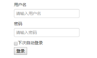
如果不加任何样式类,效果如下:
3、单选框和复选框
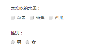
<label>喜欢吃的水果:</label>
<label class="checkbox" for="apple"><input id="apple" type="checkbox" name="hobby">苹果</label>
<label class="checkbox" for="banana"><input id="banana" type="checkbox" name="hobby">香蕉</label>
<label class="checkbox" for="watermelon"><input id="watermelon" type="checkbox" name="hobby">西瓜</label>

<label>性别:</label>
<label class="radio" for="male"><input id="male" type="radio" name="sex">男</label>
<label class="radio" for="female"><input id="female" type="radio" name="sex">女</label>
- 堆叠式(默认)
给label标签增加checkbox或radio样式类,会让label下的复选框或单选框和文字显示更好看。
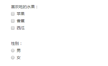
- 行内式
给label标签增加inline样式类,使复选框或单选框排列在一排。
4、文本框
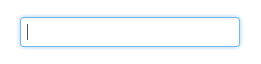
- 聚焦(focus)
Bootstrap为一些表单控件移除了默认的outline样式,为它们的:focus状态设置了box-shadow样式。
<input type="text">
{
	border-color: rgba(82, 168, 236, 0.8);
	outline: 0;
	outline: thin dotted \9;
	/* IE6-9 */

	-webkit-box-shadow: inset 0 1px 1px rgba(0, 0, 0, 0.075), 0 0 8px rgba(82, 168, 236, 0.6);
	 -moz-box-shadow: inset 0 1px 1px rgba(0, 0, 0, 0.075), 0 0 8px rgba(82, 168, 236, 0.6);
		  box-shadow: inset 0 1px 1px rgba(0, 0, 0, 0.075), 0 0 8px rgba(82, 168, 236, 0.6);
}
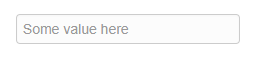
- 不可编辑
使用带有uneditable-input样式类的span表示不可编辑的输入框
<span class="input-large uneditable-input">Some value here</span>
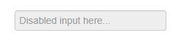
- 禁用
<input disabled="disabled" placeholder="Disabled input here..." type="text"/>
{
	cursor: not-allowed;
	background-color: #eeeeee;
}
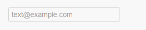
- 无效输入
:invalid选择器用于当表单元素中的值是非法值时设置样式。
<input type="email" placeholder="text@example.com"/>
input:focus:invalid,
textarea:focus:invalid,
select:focus:invalid {
  color: #b94a48;
  border-color: #ee5f5b;
}

input:focus:invalid:focus,
textarea:focus:invalid:focus,
select:focus:invalid:focus {
  border-color: #e9322d;
  -webkit-box-shadow: 0 0 6px #f8b9b7;
     -moz-box-shadow: 0 0 6px #f8b9b7;
          box-shadow: 0 0 6px #f8b9b7;
}
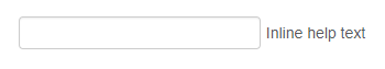
- 行内帮助文本
在form-inline、form-horizontal等的表单中使用有help-inline样式类的span标签实现行内帮助文本:
<form class="form-inline">
	<input type="text"/>
	<span class="help-inline">Inline help text</span>
</form>
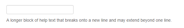
- 块级帮助文本
在帮助文本span上添加help-block样式类
<input type="text"/>
<span class="help-block">A longer block of help text that breaks onto a new line and may extend beyond one line.</span>
5、控件大小
使用.input-large相对大小样式类或.span*样式类调整到网格列的大小。
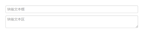
- 块级输入框
使用input-block-level将<input>或<textarea>表现为块级元素
<input class="input-block-level" type="text" placeholder="块级文本框">
<textarea class="input-block-level" placeholder="块级文本区"></textarea>
- 相对大小
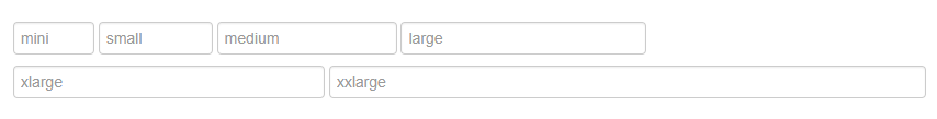
<input type="text" class="input-mini" placeholder="mini">
<input type="text" class="input-small" placeholder="small">
<input type="text" class="input-medium" placeholder="medium">
<input type="text" class="input-large" placeholder="large">
<input type="text" class="input-xlarge" placeholder="xlarge">
<input type="text" class="input-xxlarge" placeholder="xxlarge">
.input-mini {width: 60px;}
.input-small {width: 90px;}
.input-medium {width: 150px;}
.input-large {width: 210px;}
.input-xlarge {width: 270px;}
.input-xxlarge {width: 530px;}
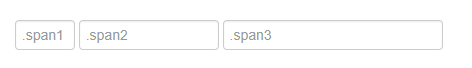
- 网格大小
<input type="text" class="span1" placeholder=".span1">
<input type="text" class="span2" placeholder=".span2">
<input type="text" class="span3" placeholder=".span3">
使用带controls-row样式类的div包围input框,可以为输入框之间增加适当的间距。
<div class="controls-row">
	...
</div>
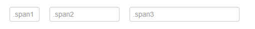
通过浮动让输入框之间缩减一些空白,设置适当的边距,并清除浮动。
.controls-row [class*="span"] {
  float: left;
}
.controls-row [class*="span"] + [class*="span"] {
  margin-left: 20px;
}
.controls-row:before,
.controls-row:after {
  display: table;
  line-height: 0;
  content: "";
}
.controls-row:after {
    clear: both;
}
6、扩展表单控件
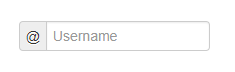
在除select控件外的其他文本框之前或之后可以添加文本或按钮:
- 前缀
使用input-prepend样式类和add-on样式类
<div class="input-prepend">
	<span class="add-on">@</span>
	<input class="input-medium" type="text" placeholder="Username">
</div>
- 后缀
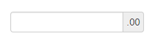
使用input-append样式类和add-on样式类
<div class="input-append">
	<input class="input-medium" type="text">
	<span class="add-on">.00</span>
</div>
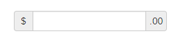
- 组合
<div class="input-prepend input-append">
	<span class="add-on">$</span>
	<input class="input-medium" type="text">
	<span class="add-on">.00</span>
</div>
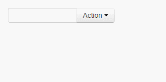
- 后(前)缀使用按钮
<div class="input-append">
	<input class="span2" type="text">
	<div class="btn-group">
		<button class="btn dropdown-toggle" data-toggle="dropdown">
			Action
			<span class="caret"></span>
		</button>
		<ul class="dropdown-menu">
			<li><a>Apple</a></li>
			<li><a>Banana</a></li>
			<li class="divider"></li>
			<li><a>Cherry</a></li>
		</ul>
	</div>
</div>
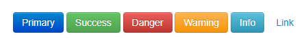
7、按钮
给任何标签添加.btn样式,该标签都会展现成按钮,一般添加到<a>、<button>或<input>标签上。
- 常用样式类
<button type="button" class="btn btn-primary">Primary</button>
<button type="button" class="btn btn-success">Success</button>
<button type="button" class="btn btn-danger">Danger</button>
<button type="button" class="btn btn-warning">Warning</button>
<button type="button" class="btn btn-info">Info</button>
<button type="button" class="btn btn-link">Link</button>
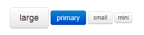
- 大小
<button class="btn btn-large">large</button>
<button class="btn btn-primary">primary</button>
<button class="btn btn-small">small</button>
<button class="btn btn-mini">mini</button>
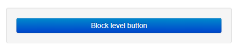
- 块级样式类
使用.btn-block可以使按钮变为块级元素,同时会填充整个父级元素
<div class="well">
	<button class="btn btn-primary btn-block">Block level button</button>
</div>
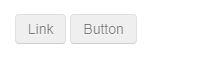
- 禁用
可以给<a>标签添加.disabled类或给<button>标签添加disabled属性实现按钮的禁用状态
<a href="#" class="btn disabled">Link</a>
<button class="btn" disabled="disabled">Button</button>
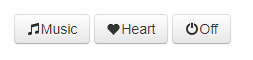
- 带图标的按钮
<a class="btn"><i class="icon-music"></i>Music</a>
<a class="btn"><i class="icon-heart"></i>Heart</a>
<a class="btn"><i class="icon-off"></i>Off</a>
8、图片
img-rounded
<img class="img-rounded" src="img/bird.png">
img-circle
<img class="img-circle" src="img/bird.png">

img-polaroid
<img class="img-polaroid`" src="img/bird.png">